How the TechChange Live Student Map Works
|

Building a global classroom that feels personal and intimate isn’t an easy job for any online facilitator. Which is why the TechChange platform comes equipped with data and dashboards to help data-driven decisions on course execution. But we also wanted to provide that information back to students, who are just as vital in improving the learning environment. And at the center of both concepts is the TechChange Live Student Map.
When the average TechChange class has 93 students from 22 countries, it can be tough to keep track of where students. But part of our goal is to not only connect students online, but also in person and in their career networks to continue learning long after the course ends. That’s why students who volunteer their city locations are able to see which other students have volunteered their city location, as well as their student @handle, social media presence, and other details in their profile.
But how does it work?
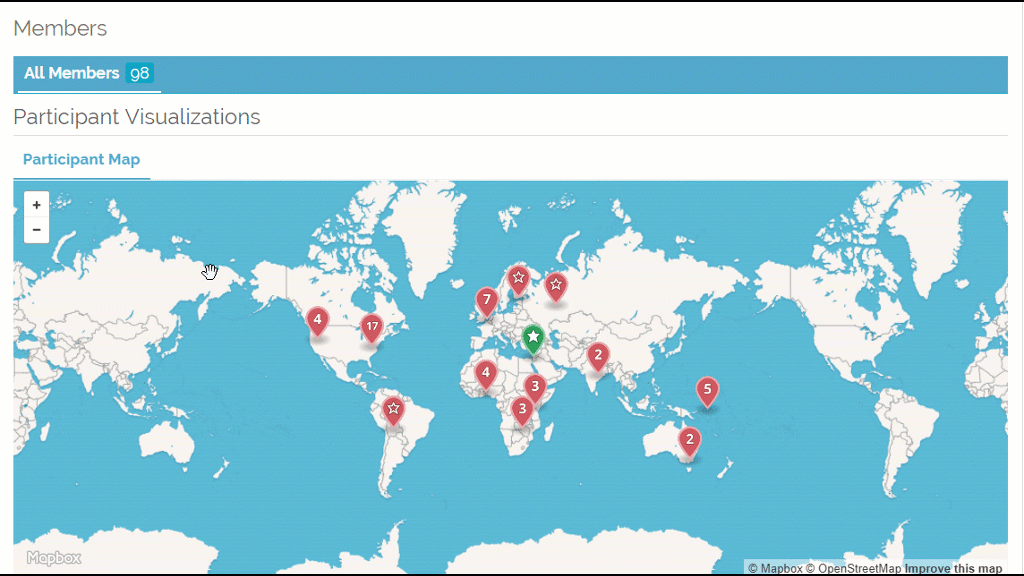
First we start with a generic base layer from Mapbox. And when a user submits their location in their profile we send their location only to a service that maps locations to latitude and longitude coordinates, which is needed to plot their city location. We then take that location data and build a dataset of the locations of each participant.
On top of the map layer we draw an additional layer placing map markers on each user’s location. We quickly realized that multiple people specifying the same city would be a challenge as map markers are independent of each other, so essentially the map markers for anyone in Washington, DC would be drawn on top of each other and the last person drawn on the map would win.
In order to solve this problem, we used a clustering algorithm to group map markers within a certain distance of each other. This clustering takes into account zoom level. At the furthest out zoom, all users on the east coast may be grouped together. As you zoom in, users in the same city may be grouped, etc.
And so, finally, when when you click on a group of users, all the users in that cluster are revealed so that each one can be clicked on individually. When you visit the platform, we open up a persistent link to our servers that we can use a proxy for users being actively online. We use this connection to identify users that are currently online and update the map markers accordingly (switching from red “offline” markers to green “online” markers).
We’ll keep adding more information as we build out our mapping and visualization tools, but if you’d like to learn more about mapping data, check out our online course on data visualization and analysis.

Editor’s Note: This post has been revised to reflect corrections submitted by PeaceTXT and Sisi Ni Amani I’ve long...

Since 2015, over one-hundred organizations have endorsed the Principles for Digital Development—a set of nine “living” guidelines that can help...

Featured image credit: Janjua Amolksimranjit Singh It was an immense pleasure to be a part of the two-day TechChange course ‘Mobile...