How Daily Data Visualization Brings Us Together
|
What stories would you tell with data from your daily life?
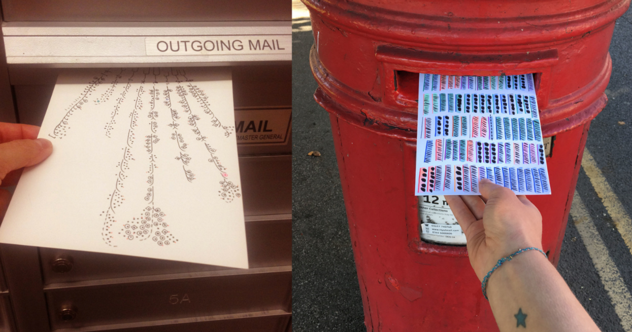
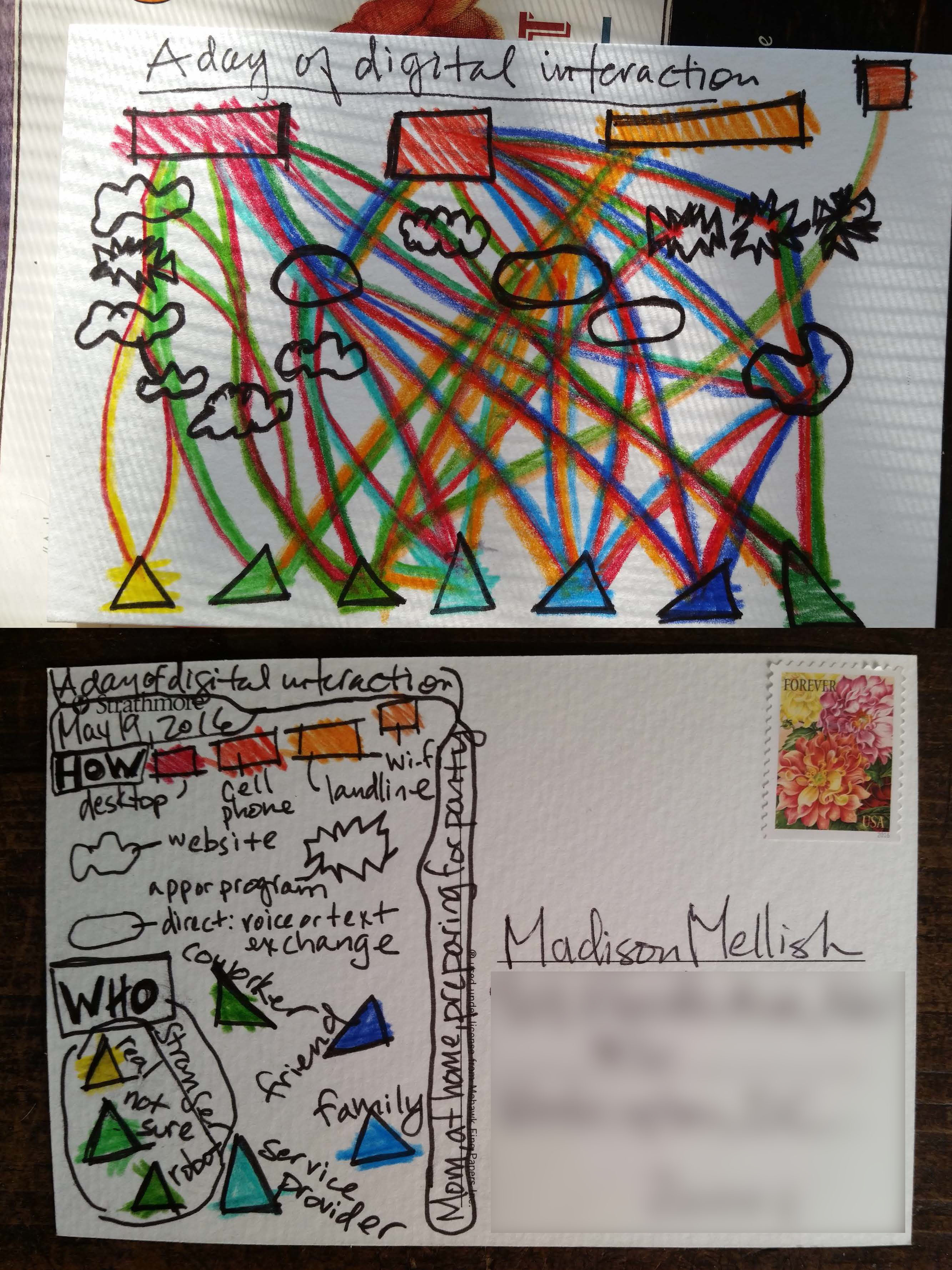
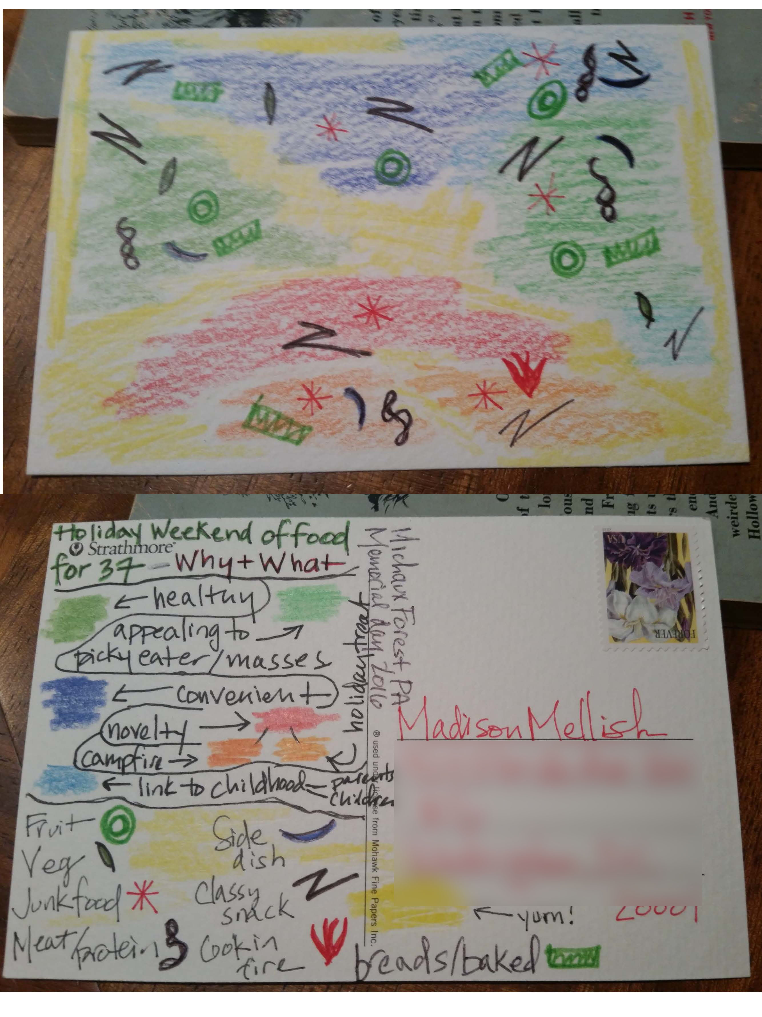
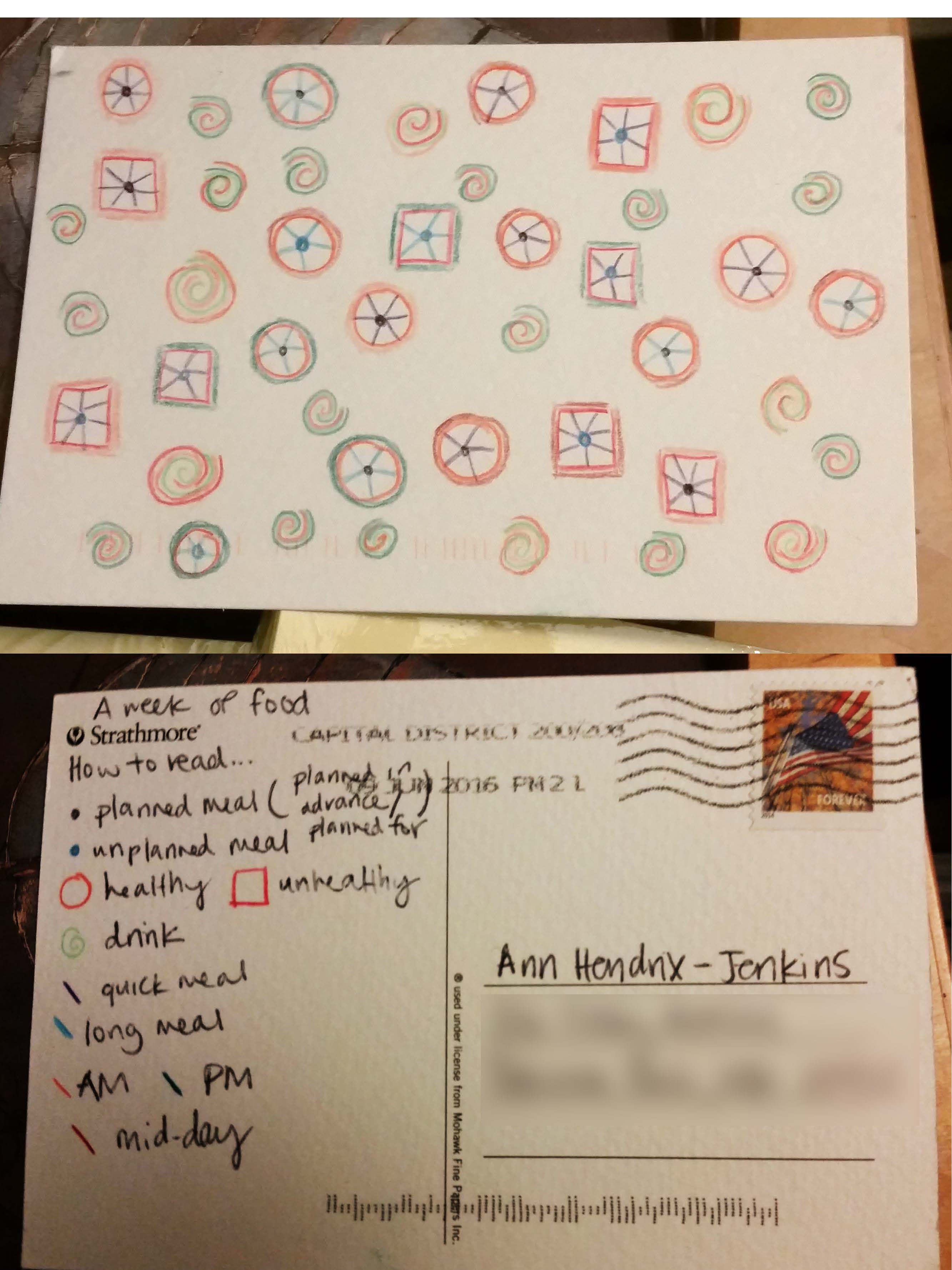
In September 2014, two award-winning information designers living on different sides of Atlantic, Giorgia Lupi and Stefanie Posavec, collaborated on a year-long project to collect, visualize, and share information about their daily lives. Each week they would hand-draw representations of their activities and thoughts as part of a process to use data to become more humane and connected on a deeper level. The end result is Dear Data: an award-winning project to make data artistic, personal, and open to everyone.
(Watch starting at 6:45)
In Spring 2016, we asked online students in our Tech for Monitoring and Evaluation Online Diploma Program to try their hand at a similar month-long project and send postcards to one another. As we have 110 students in 35 countries, many of whom had only just met in the preceding weeks, this provided an excellent opportunity to recreate some of what made Giorgia and Stefanie’s project so special. And it gives me great pleasure to share some examples of their work.
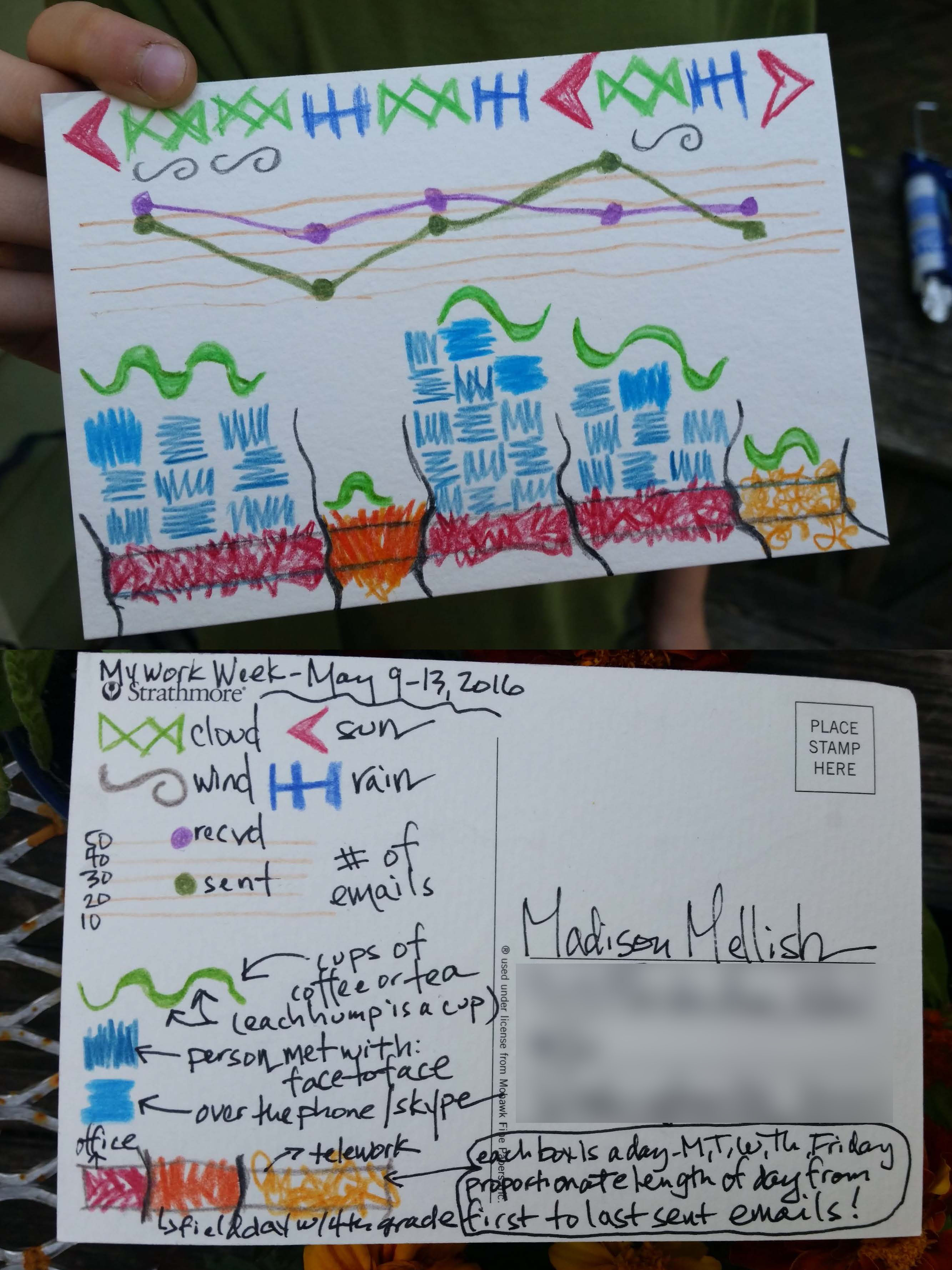
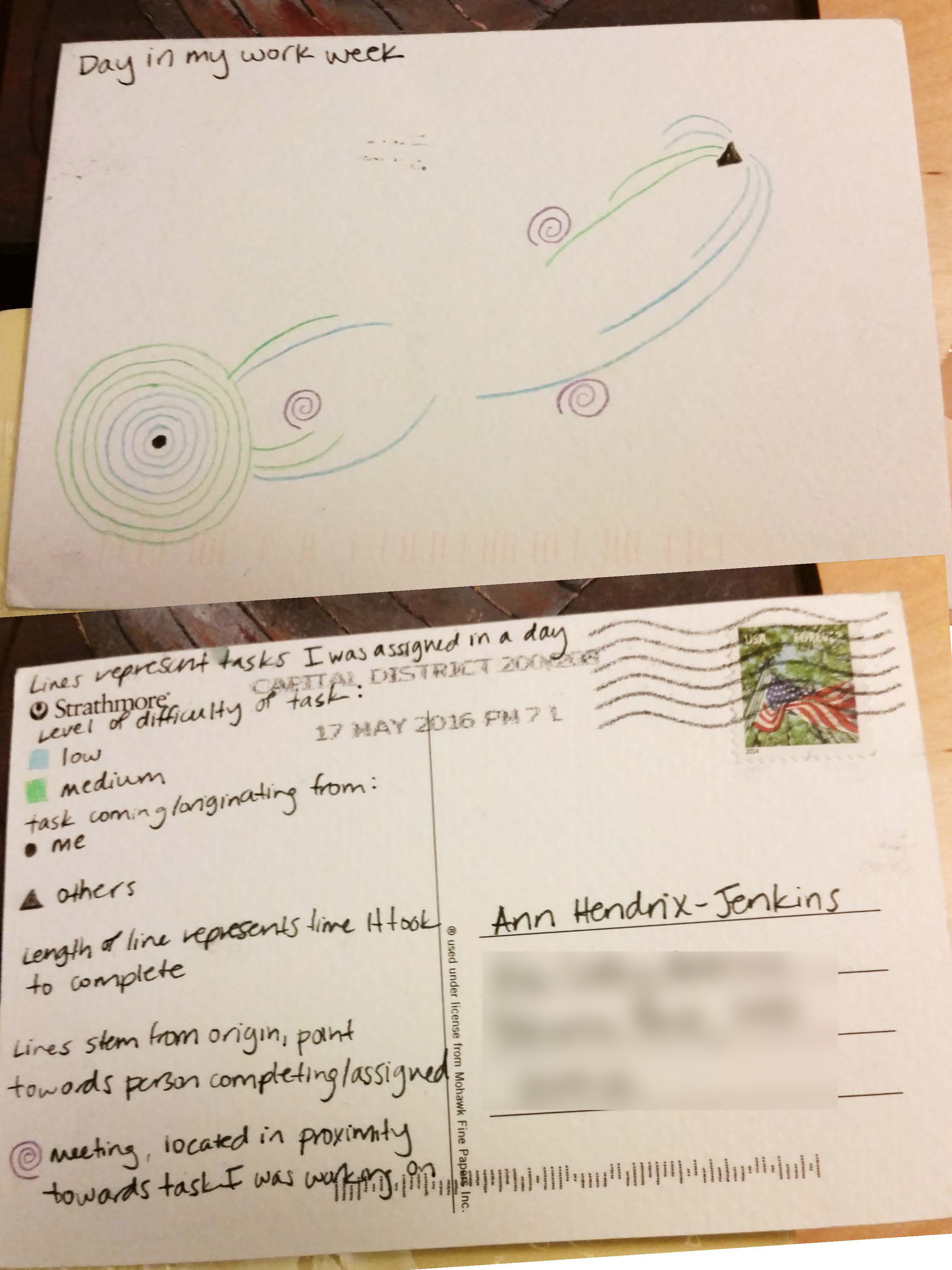
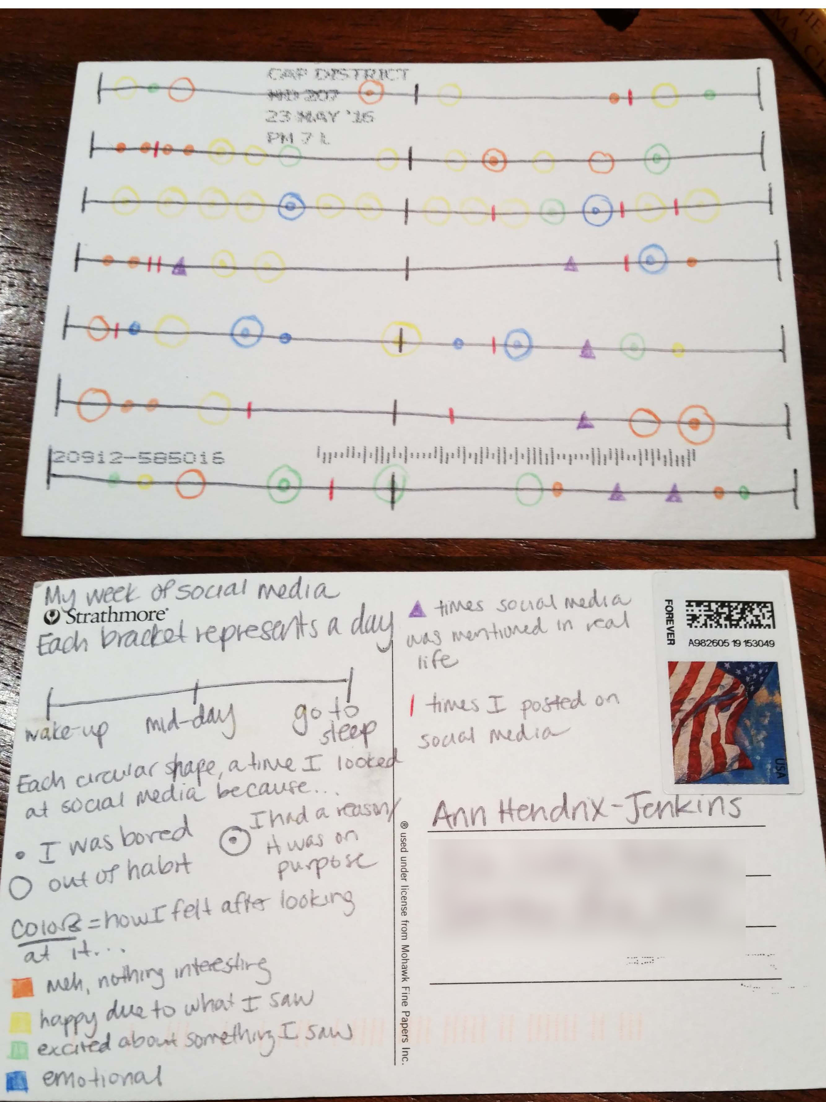
For one project, two of our students (Madison and Ann, who both work with Health Policy Plus), sent one another postcards every week on the following four topics:
These postcards are presented without commentary below, so that you can see the postcards as they did.
When asked for their reflections as part of the exercise, both Madison and Ann claimed that the process made them mindful of issues and habits that they had previously ignored, and that they were able to discern larger patterns when looking at their week as a whole. Though neither were professional information designers, their work improved over multiple iterations, as well as became a fun, inclusive process.
“Our different styles quickly became apparent and added to the reflective learning. Apparently Madison is calm and cool, and Ann is, well, a bit excitable,” said Madison.
“The involvement of friends and family was an unplanned bonus. Visualization and art attracts attention…they got drawn in (especially Ann’s 10 year-old son Harry) and got a kick out of seeing what arrived in the mail,” said Ann.
And both agreed: “Overall it was a fun challenge—we highly recommend it. Many thanks and acknowledgement to Giorgia Lupi and Stefanie Posavec, the Dear Data creators”
If you’re interested in learning more about how you can better collect, visualize, and make decisions based on data, check out our 16-week Tech for Monitoring and Evaluation Online Diploma Program and enroll today. First course in the track starts September 12th.
Week 1: Days in My Work Week
Week 2: Social Media
Week 3: Food
Mobile Health: How Far We’ve Come When I first started in the field of technology for development back in around...
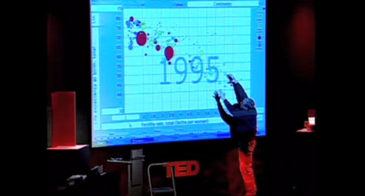
In his 2006 TED talk, Hans Rosling used data visualizations to deconstruct his students’ assumptions about the ‘developed’ and ‘developing’...
TechChange courses are designed for busy young professionals. In any of our courses, you will find yourself taking the course...