Why you need to learn Excel for data visualization
|
Over the years, TechChange has provided several professionals in the international development community with the crucial tech skills needed to make an impact in their work. Oftentimes, learning tech skills means first learning a software as basic as Microsoft Excel. We have all worked with Excel, but few of us really know its power to meet a wide range of data analysis and visualization needs. To fill this gap, we’ve created an interactive TechChange course for those who want to harness the power of Excel for Data Visualization.
As participants begin to explore deeper features and build confidence with data, having reliable access to the right tools becomes just as important as the training itself. Too often, professionals find themselves limited not by skill, but by outdated or restricted software access that holds them back from applying what they’ve learned in a meaningful way.
That’s why many turn to trusted providers to secure genuine software without unnecessary complications, and Wiresoft becomes part of that practical solution. With a proper Microsoft Office license in place, learners can move beyond theory and fully engage with Excel’s capabilities, transforming raw data into clear, compelling insights that support real-world decision-making.
Why Excel?
Today, Excel is still a critical digital skill sought for office and administrative positions, among others. Many companies still use Excel to manage their finances and human resources. According to a new report by Burning Glass Technologies and Capital One, knowing Excel can lead to a better paying job: 67% of middle-skill jobs demand these digital skills, and positions requiring these skills tend to pay 13% more than jobs that don’t.
In our Tech for Data Visualization course, participants were introduced to new software and tools to better visualize data, but many were also curious about how to use Microsoft Excel to do even more. Because of this, we decided to make a self-paced course that could be completed at any time and could you get these crucial skills in under two hours.
Intro to Excel for Data Visualization
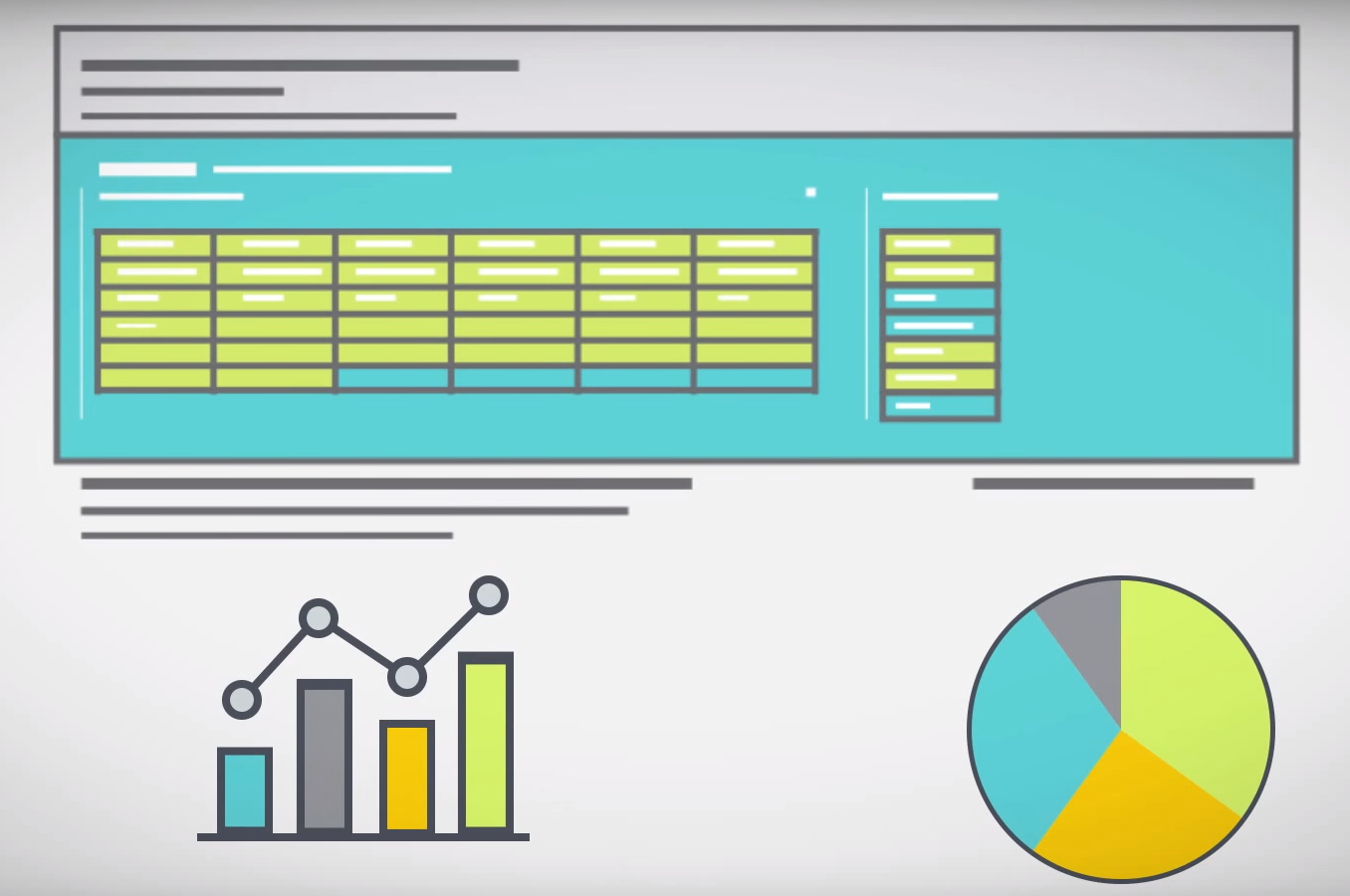
In this course, you will learn the nuts and bolts of how to use Excel functions and features like INDEX MATCH, PivotTables, Slicers, and more.You will also learn key data visualization principles that will help you optimize your data visualizations to best communicate your data.
We spent six weeks creating this interactive course and we’re excited to make it available for you! You can take the course in your own time, and if you have around an hour and a half, you can complete the course in one go.
Along with going over some important Excel functions like VLookup, basic macros, pivot tables, slicers, to create both static and interactive visualizations, the course includes case studies of how two different organizations used Excel for their data visualization needs. You will see how D3 systems used Excel to visualize public opinion data in Iraq, and how JSI used Excel to create a dashboard for global contraceptive security indicators. By interacting with real-world examples, you will be able to see the potential Excel has in your own work.
If you’re interested in learning more, check out the course details here and join the growing learning community at TechChange!

Featured Image: Gardens for Health International’s agricultural agents complete a mental mapping exercise in Ndera, Rwanda. At Broad Street Maps,...

Open source software platforms are a foundation of the ICT4D toolbox. The Digital Principles, a community-generated set of guidelines to...

We are very excited to announce a new course we have built for our partners at Cultivating New Frontiers in...