Cross-posted from Samhir Vasdev’s Medium channel.

This tutorial accompanies the Amazon episode of our new series about liberating and visualizing our personal data. Check it out below:

A snapshot of my Amazon order history reveals my heavier spending on Fridays. Full infographic here.

I’m hooked on Amazon.

And I’m sure I’m not alone. So this week, Nick Martin and I dug into our Amazon accounts to explore just how bad we’ve got the Amazon bug. This post walks through the process of finding and cleaning the data we tackled in that episode.

4 out of 5 stars on my data cleaning score test. Check out the full video.

This data gets a 4 out of 5 on my entirely unscientific data cleaning score test. It’s pretty easy to access, and it needs just a bit of fiddling to get in a good state to surface some useful insights.

To follow along, you’ll need accounts at Amazon and Piktochart and a basic understanding of how functions work in spreadsheet tools like Excel or Google Sheets. You won’t need a particularly powerful computer to work with the dataset, and the whole process should take about an hour. In that time, we’ll turn the raw data into this sleek, interactive presentation.

Piktochart offers a robust presentation mode with sleek transitions and interactivity.

Tutorial

A brave , if futile, attempt at organizing and explaining the process I used to get, clean, and visualize my Amazon data.

This is a long and detailed post, so here’s a roadmap in case you want to jump to the part you care about most:

  • Get the data
  • Inspect the data
  • Clean the data
  • Visualize the data
  • Next steps
  • Reflections

First, get the data.

Amazon makes this process outrageously easy. Just visit the Order History Reports page, enter in the date range you’d like to use (I requested everything from 2006 thru 2016), then click “Request Report”.

Look for your Order History Reports to get to the data.

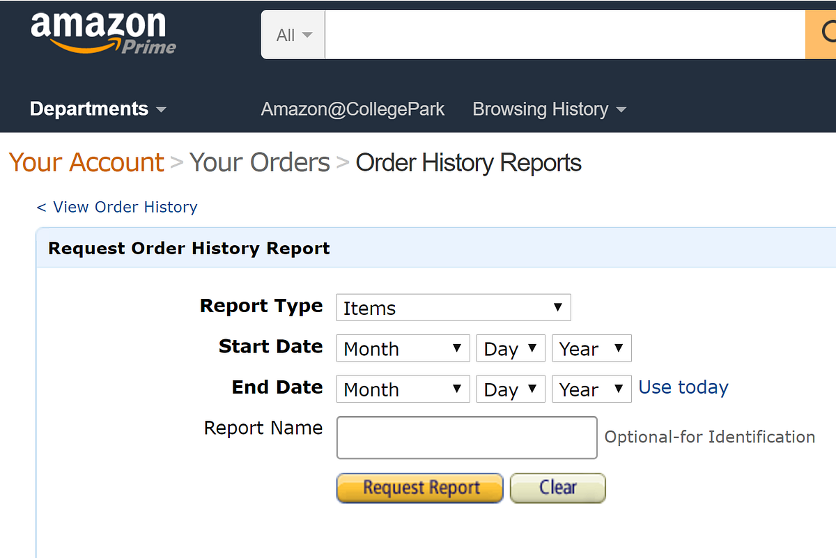
Amazon offers two report types: items and orders. Download and explore both of them to see which suits your interests; I used the items option, mainly because I it had more information about the specific things I purchased. It’s a relatively small file (mine was 128KB, or about as much as a Facebook photo), so it shouldn’t take long to download in most settings.

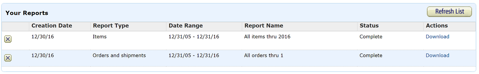
Once you’ve requested the report, you’ll see it appear in a “Your Reports” box below the order request section. This is nifty because it saves all your previous reports, still available for you to download down the road. Other websites don’t usually keep such easy access to previous reports (LinkedIn, for instance, e-mails you a special download link that eventually expires).

It’s easy to access previous data requests through Amazon.com

The data downloads as a single CSV file, which is a common format to store simple information in a table (here’s a good explanation of the difference between CSV and Excel files).

Next, inspect the data.

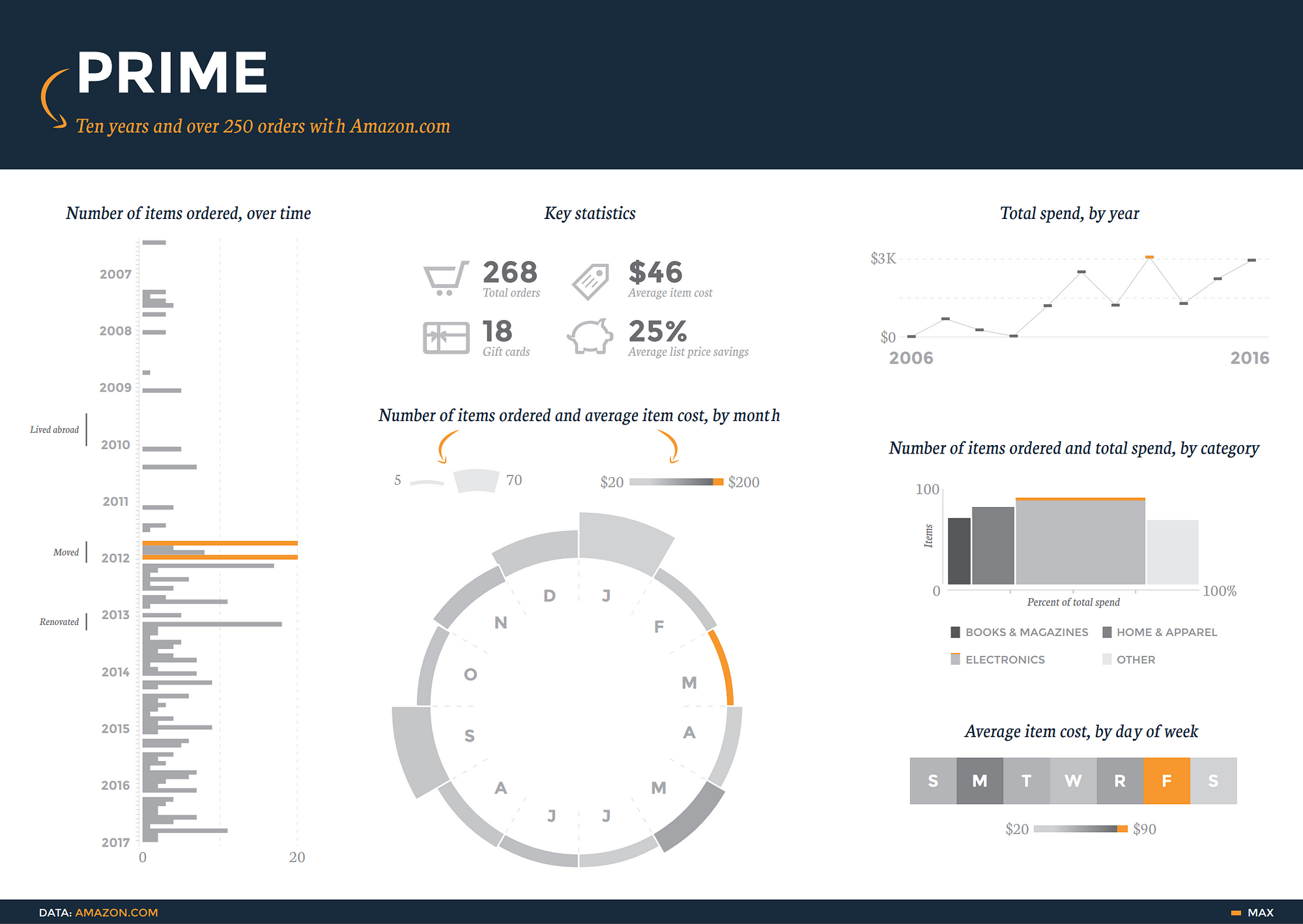
Each of the 300+ rows corresponds to a different item that I ordered, and there are 40 columns with fields describing everything from the order date and payment method to shipping address and item category (such as “paperback” and “sports”). The diversity and clarity of the dataset is remarkable.

Also, a quick skim in Excel shows that most cells have content — there aren’t any gaps — and the column titles do a good job of explaining what they represent (this isn’t always the case, and that’s when good metadata comes in handy).

Based on what I saw, I figured it would be useful to learn how my purchase patterns evolve from year to year. But the raw data doesn’t have a column for “year”, so I needed to extract that information from the “order date” column.

Clean the data.

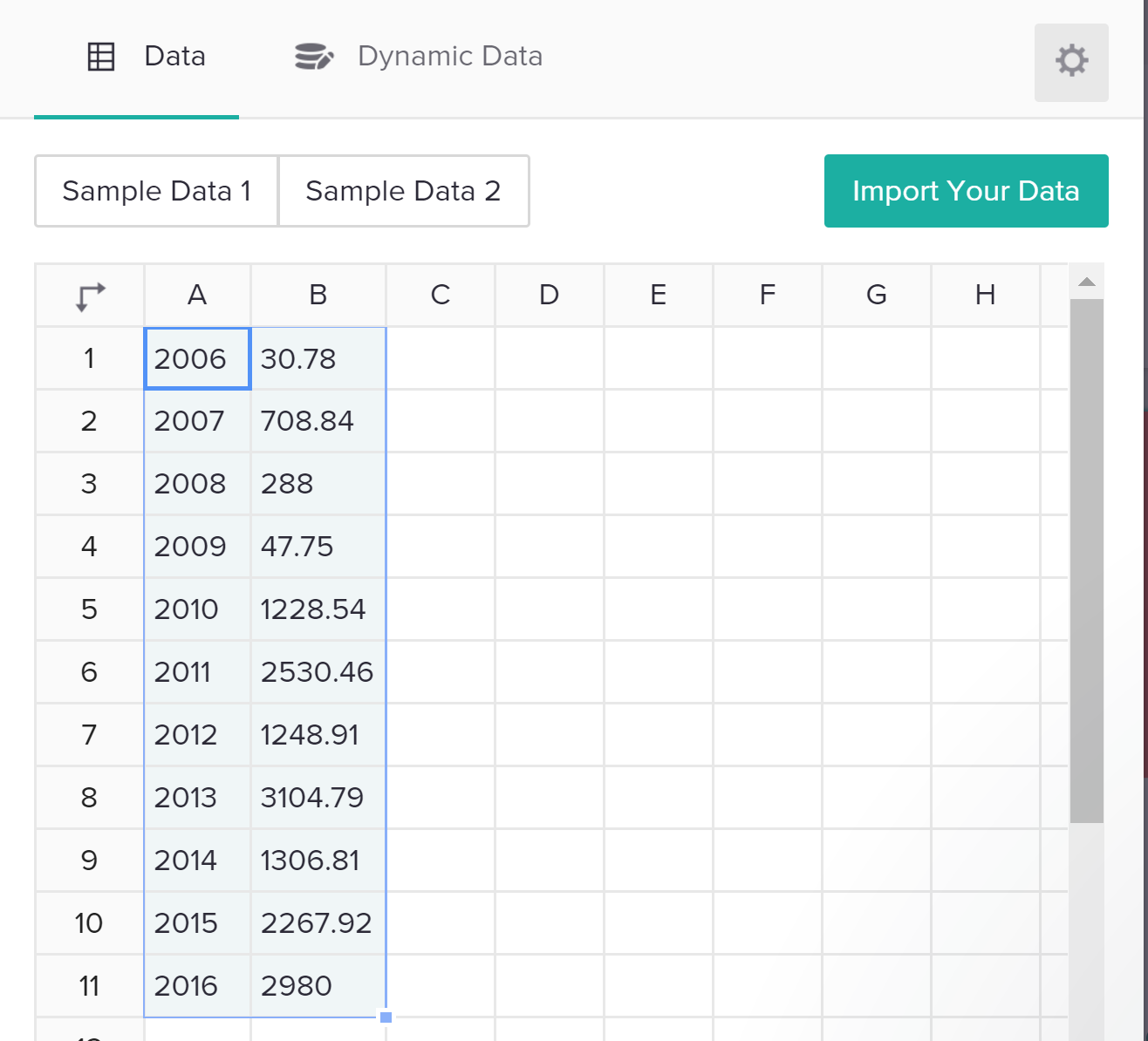
Extracting the year of each item can be done with a formula (School of Datahas a great primer on formulas). Use the TEXT formula in a new “year” column. For example, if the order date in cell A2 was “7/24/2006” and I’d like to put the first three characters of the year into cell B2, I’d put this into B2:

=TEXT(A2,“YYYY”)

to get:

2006

Nice. Now, just double-click the bottom-right corner of the cell B2 (or whatever cell you just ran the formula in) to apply the formula to all cells beneath it. (By the way, this TEXT function is pretty flexible about what you put within the quotes.) For instance, writing:

=TEXT(A2,“ddd”)

would return:

mon

Anyways, now we have a column that shows the year that every order was placed in, and we can surface some insights that reveal milestones and patterns in my own life. For example, my spend plummeted while I was living abroad in 2009, and it spiked in 2011 and 2013, when I moved and renovated my apartment.

Visualize the data.

Let’s use Piktochart to make an interactive presentation that shows the change in my annual spend over time — something like this:

The full presentation has some other nifty charts as well.

To get here, jump over to Piktochart to make an account — it’s free, and you can log in from Google or Facebook (they won’t post anything without your permission).

Next, start out by creating a presentation (you could also create an infographic, or even a printed product ). You can choose from one of many free templates (many more are available with a paid plan); don’t worry about things like fonts and colors since you can customize them later.

Once you open the presentation, you’ll see it’s filled with dummy content. You can dive right in to edit things like text areas, just as you would in Powerpoint. You can also use the menu options on right to add or change graphics images, including pulling from many free icon and photo libraries.

To make a chart, click on a slide within the presentation where you want the chart, then click on the “Tools” menu option on the left, then “Chart”. This will open a new chart editor window. Take a minute to acquaint yourself with the layout; this article and image will help. Start by pasting your data from your CSV file into the data editor in Piktochart.

Importing data is as easy as copy/paste — but you can also use dynamic data sources, like a Google Spreadsheet that changes over time as people submit Google Form responses.

You’ll see the chart area, on the left of the data, animate in real-time with the data you’ve just added. Select the chart type you want (in this case, let’s go with a line chart), and then go ahead and edit any fields you’d like, such as the chart title or axes. I found this process to be easier than in Powerpoint or Excel, which can be a bit tedious when editing these features.

Be sure to take advantage of that little gear icon in the top-right of the data area; this is where you can customize a range of elements like the colors, gridlines, positions, and more. After that, just click “Insert Chart” to see the chart pop into the slide you had selected when you started this process.

Boom! You just made your first online, interactive chart with your own Amazon order history. After taking a minute to bask in your glory, start poking around to see how you can add slides, edit some of the existing content, and change styles like backgrounds.

Finally, like any good interactive chart, you want to be able to share it. There are several easy ways to do that, and they all sit in the “Share” menu option at the top-right of the Piktochart screen. You can share a link directly to the presentation, or export the file to tools like Slideshare. You can also embed the presentation into your website, although this takes a bit of basic familiarity with HTML language. Here’s a good overview of the sharing options. Go show off your data!

Next steps

A data addict’s search for (mostly useless) insights is never over. I’d like to return to this data and see how my item categories evolved over time; I’ve a suspicion my physical book purchases were heavier in my college days, while e-book purchases increased once I finally downloaded a Kindle app a few years ago. If you discover something like this in your data, share in a comment!

I also used Illustrator to design some more visualizations to unlock some other insights from my Amazon history. Check that out here.

If you read this far, you deserve a prize. Kudos.


What does your Amazon history say about you? Have you used Piktochart or other similar tools to visualize this or other info? How was this tutorial? Comment and share!

What stories would you tell with data from your daily life?

In September 2014, two award-winning information designers living on different sides of Atlantic, Giorgia Lupi and Stefanie Posavec, collaborated on a year-long project to collect, visualize, and share information about their daily lives. Each week they would hand-draw representations of their activities and thoughts as part of a process to use data to become more humane and connected on a deeper level. The end result is Dear Data: an award-winning project to make data artistic, personal, and open to everyone.

(Watch starting at 6:45)

In Spring 2016, we asked online students in our Tech for Monitoring and Evaluation Online Diploma Program to try their hand at a similar month-long project and send postcards to one another. As we have 110 students in 35 countries, many of whom had only just met in the preceding weeks, this provided an excellent opportunity to recreate some of what made Giorgia and Stefanie’s project so special. And it gives me great pleasure to share some examples of their work.

For one project, two of our students (Madison and Ann, who both work with Health Policy Plus), sent one another postcards every week on the following four topics:

  1. Daily activities
  2. Social media
  3. Food
  4. Emotions

These postcards are presented without commentary below, so that you can see the postcards as they did.

When asked for their reflections as part of the exercise, both Madison and Ann claimed that the process made them mindful of issues and habits that they had previously ignored, and that they were able to discern larger patterns when looking at their week as a whole. Though neither were professional information designers, their work improved over multiple iterations, as well as became a fun, inclusive process.

“Our different styles quickly became apparent and added to the reflective learning. Apparently Madison is calm and cool, and Ann is, well, a bit excitable,” said Madison.

“The involvement of friends and family was an unplanned bonus. Visualization and art attracts attention…they got drawn in (especially Ann’s 10 year-old son Harry) and got a kick out of seeing what arrived in the mail,” said Ann.

And both agreed: “Overall it was a fun challenge—we highly recommend it. Many thanks and acknowledgement to Giorgia Lupi and Stefanie Posavec, the Dear Data creators”

If you’re interested in learning more about how you can better collect, visualize, and make decisions based on data, check out our 16-week Tech for Monitoring and Evaluation Online Diploma Program and enroll today. First course in the track starts September 12th.

Week 1: Days in My Work Week

data viz slides_Page_03

data viz slides_Page_04

Week 2: Social Media

data viz slides_Page_06 data viz slides_Page_07


Week 3: Food

data viz slides_Page_10


data viz slides_Page_09

We consume and produce data at ever growing rates, aiming to better understand the past, observe the now, and to be better prepared for the future. However, data can only fulfill its purpose when we can make sense of it, generate insights, and put it into action. The process of turning data into insights requires many steps, and doing it effectively involves many strategies.

Step 1: Visualization

One of these key steps is visualization, which is the visual organization of data using various shapes, sizes, colors, and layouts. Visualization creates data charts such as bar graphs, line graphs, scatterplots, and even maps and networks. This step helps us make sense of large volumes of abstract information, without much effort. Effectively using the visual language for data provides a natural, intuitive way to see and understand features and trends in data.

Step 2: Interaction

Another key step is interaction. When you ask questions, focus on certain properties, or change the visual representations, you are engaging in an interactive dialogue with your data. The vast computing capabilities in our digital devices allow us to dynamically filter across categories, resort items, pan map views, retrieve details, and explore alternatives. Together, visualization and interaction with data lets you find the answers you are looking for, and answer the questions that you didn’t know you had!

Step 3: Putting It All Together

How can you start your data dialogue? There are many tools to help you collect, transform, and visualize data in many different forms. However, with so many options, choosing the best approach based on your needs, your data, and your experience level is not trivial. You may start visualizing your data with tools that offer a graphical interface. This allows you to import a dataset and construct data charts by selecting chart types or mapping data attributes to various visual elements and components (shapes, colors, layouts, x-axis, etc.). Existing graphical charting tools still require training to make effective visualization decisions, or they do not let you easily engage in rich analytical conversations with your data in multiple synchronized perspectives. For customized analysis and design needs, you can use programming based tools, but these require significant technical knowledge to figure out and execute the best strategies. How can you get the most from your data, with the least amount of effort, and in the shortest time?

The Solution: Keshif

Keshif is a new web-based tool that brings life to your tabular data by converting it into a beautiful interactive visual interface. Unlike other tools, it creates an environment where you focus on interpreting your  data, rather than specifying the visualization details and getting lost in the many visual  options that may slow you down, or mislead you. Keshif is designed to fit your data exploration needs, the structure of your data, and expands on the best practices. Your categorical data becomes bar graphs, your numeric data becomes histograms, your time data becomes line graphs, all without any effort. For more in depth analysis, you can view your data by percentiles and map regions. Each record of your data can be shown individually in a list, grid, map, or network (if your data supports it).

Everything in a Keshif data browser is connected and highly responsive so that every action is a potential to a new insight. You can highlight to get a quick preview, filter to focus on details, or lock to compare different sections of your data easily. You can import your data to Keshif from Google Sheets, CSV, or JSON files, and decide which attributes you want to explore. This can be done by summarising their characteristics, and manipulating  your data in various ways to explore different trends and relations. From journalism to government, transportation to finance, and music to sports, Keshif can be used for data in many different domains. With it’s minimal, yet powerful features, Keshif lets you make sense of your tabular data quickly, analyze it in multiple perspectives, and reach new insights.

Keshif-TechChange

Keshif is under active development by Ph.D. candidate M. Adil Yalcin and his advisors Professor Niklas Elmqvist and Professor Ben Bederson at the Human Computer Interaction Lab at University of Maryland College Park. To learn more about Keshif, visit its homepage www.keshif.me, find a topic that interests you across the 150 datasets specially compiled, and watch the short tutorial video

About the Author:

M. Adil Yalcin, is a Ph.D. candidate at the Department of Computer Science at University of Maryland, College Park. His goal is to lower human-centered barriers to data exploration and presentation. His research focuses on information visualization and interaction design, implementation, and evaluation. He is the developer of Keshif, a web-based tool for rapid exploration of structured datasets. In his previous work, he developed computer graphics techniques and applications.

If you have any further questions, join Keshif’s email list or contact yalcin@umd.edu.

adil-yalcin-headshot


How do you make the invisible visible? How can we keep up with our ever-changing world, and how can we utilize the technologies of our time? Upon the completion of TechChange’s Mapping for Social Good course, we have found that some answers lie within the realm of digital mapping and geospatial data collection.

From Theory to Practice

The course features four weeks of case studies and real-world map applications, a diverse set of guest speakers, and innovative tech tools to invoke critical spatial analysis with social and environmental perspectives. Each new week introduced a set of social and environmental themes. Issues such as Water, Sanitation, and Hygiene required an advanced geographic understanding of land use and climate patterns to produce meaningful maps, and cutting edge tools such as CartoDB, Mapbox, and Leaflet empowered our understanding through spatial analysis.

In search of balance, participants discussed the necessary steps in designing an attractive, efficient, and safe urban infrastructure in Abu Dhabi, and discovered the complexity of the plan. Taking into account population, available surface area, and the availability of funds and resources, the course discussion forums were flooded with professional expertise and insight in how to build infrastructure that reflects the city’s urban lifestyle.

But Data Considerations Aren’t Only About Tech

A discussion on ethics can often be overlooked in this technical environment. But in Week 3, Nathaniel Raymond of The Signal Program on Human Security and Technology led a talk that highlighted recurring challenges associated with technology and humanitarian efforts. In doing so he introduced the concept of Demographically Identifiable Information (DII) – a close relative to that of Personally Identifiable Information (PII). His message put forth “Do No Harm” caution to humanitarians, encouraging critical thought and consideration for the most vulnerable populations in our world, remembering that we both hold, yet lack, so much power with technology.

Engaging Formal and Informal Institutions

Of note was the interaction between the global volunteer community of mappers and major donor institutions. A team of geographers and cartographers from the State Department’s Humanitarian Information Unit joined the class to discuss Mapgive and Imagery to the Crowd, a program that provides satellite data to global volunteers during times of crisis, and shows just how far the digital humanitarian community has come in the past decade.

Interactivity in Online Education

Throughout the course, participants presented their digital maps, addressing fundamental questions like, “what is the purpose of this map?” and, “will it give us exactly what we need, or simply what we think we need?” We’ve seen land-use maps of Washington, DC, conflict maps tracking violence against civilians in Libya using QGIS, and district density maps using the CartoDB application.

Upon completion of the TechChange course, “Mapping for Social Good,” we hope that participants feel well-equipped with some of the best mapping resources of our time, and that they have taken their professional experiences to new and challenging levels.

About the Authors
Madeline is a student at James Madison University, where she studies Political Science, Humanitarian Affairs and Geographic Information Systems, with a special interest in Conflict Resolution and International Landmine Prevention. In her free time, she loves to bike, paint, and eat chocolate pie while listening to Dave Brubeck.Madeline Profile Picture

Greg works on training and analytics with the Bureau of Conflict and Stabilization Operations at the US Department of State. He has spent his career working at the intersection of conflict resolution, technology, and the arts. Trained as a mediator, he also worked with the Northern Virginia Mediation Service and the US Institute of Peace. As a technologist, he has leveraged Geographic Information Systems for health interventions, humanitarian response, and conflict analysis purposes. He holds an MA in International Studies from the Josef Korbel School of International Studies at the University of Denver.Greg Maly Profile Picture

TechChange courses are designed for busy young professionals. In any of our courses, you will find yourself taking the course alongside international development field and headquarter staff, university professors and students, freelancers, and so many other kinds of eager learners. Today, we are excited to chat with Eva Erlach, who is a full-time law student in Vienna, Austria and also works part-time for Ground Truth Solutions. Eva recently took our Technology for Data Visualization course. We caught up with her to see how she was able to apply what she learned in the course.

How did you come across the TechChange course?
At Ground Truth Solutions, I am regularly tasked with producing reports on the perceptions of crisis-affected people during humanitarian actions. In order to visualize the data, I was looking around for the best resources to learn more about data visualization. I came across TechChange’s Tech for Data Visualization course on Twitter and my employer helped me pay for the course.

Have you taken online courses before? What did you think of the TechChange course?
This was actually my first online course and I was very impressed. The ability to interact with other participants in the course was great! Also, since the live events with guest experts were always recorded, and I could revisit the course materials for four more months, it really gave me flexibility to manage my time to make the most out of the course. There were a lot of resources — which is always better than having less — and that gave me freedom to either just get an overview of the topic or dig deeper on the topics most useful to me.

Are you new to data visualization?
I have actually been doing data visualization for a while, and mainly on Excel. I also knew of the other data visualization tools but wasn’t sure which ones were good ones and how to really work with them. This course gave me the insights I needed on different data visualization tools. It also helped me see that you can do much more data visualization just with Excel. Most of the other data visualization software tend to be expensive, so learning more about data visualization on Excel was great.

How did you use what you learned in the course at Ground Truth Solutions?
I worked on Ground Truth Solutions’ three reports on community perceptions in the Nepal crisis. As part of the Inter-Agency Community Feedback Project, Ground Truth’s role is to provide the government of Nepal and aid agencies with real-time feedback from affected people and recommendations based on that feedback.

Our audience for this report were agencies involved in the humanitarian response in Nepal. Since the agencies wanted to be able to print and disseminate the reports to field staff as well as email to their branch offices, we decided to do a pdf report instead of an interactive dashboard. I used R for the analysis and created the graphs on Excel. I then created the maps on Inkscape, and used a python script for the labels and colors.

A snapshot of Ground Truth Solutions' Community Survey Report 3

A snapshot of Ground Truth Solutions’ Community Survey Report 3

I was able to visualize the data in a better way because of the course. The reports are available on our website to download and we have been promoting it all over social media.

How has the course been useful to you?
The course really allowed me to understand data visualization on a deeper level, and to realize that we really need to think about the audience for any visualizations you work on and the kind of message you are trying to communicate through the visualization.

Would you recommend this course to a friend or colleague?
Absolutely!

Interested in learning more about how to use technology for your organization’s data visualization needs? We start our next Technology for Data Visualization online course on Monday, November 23! Join participants like Eva in this four-week online course!

About Eva
Eva
Eva Erlach is a program analyst at Ground Truth Solutions. The aim of Ground Truth is to support humanitarian actors to systematically listen and respond to the voices of affected people. Eva holds an undergraduate degree in Development Studies and is currently finishing her law degree at University of Vienna, specializing in human rights. She has volunteered on social projects in India and Uganda and has experience in the field of asylum law and domestic violence.

Social media has become a very important diplomacy tool to engage with the public. Realizing the evolving nature of diplomacy in the 21st century, the Italian embassy in Washington, DC regularly hosts their #digitaldiplomacy series to discuss the role of technology in diplomacy and to engage with all stakeholders and partners.

Today, there are tech tools, beyond social media, that have the potential to promote diplomacy and engagement, so we collaborated with the Italian embassy to discuss the other players in the digital diplomacy field. Moderated by our founder, Nick Martin, our panel included Sarah Frostenson (Vox Media), Heba Ghannam (State Department Professional Fellow), Sarah Heck (White House), Suzanne Philion (Yahoo!), and Jennifer Walsh (U.S. Department of State). Our panelists shared their experience about the impact that data visualizations, digital mapping, and e-learning can have on diplomacy today.

Here are a few takeaways of an evening of great insights and engaging conversations:

Digital maps can tell powerful stories

While important pdf reports may be buried online, maps can tell a compelling story understood by all.

The ongoing refugee crisis has affected many families, but for someone living far away from the region, it can be difficult to see its global impact. Sarah Frostenson from Vox Media presented how putting the refugee story on a map, like The Refugee Project can have a much bigger impact and urge respective governments to work towards a solution.

Mapping has been a great asset in disaster response. Digital maps have allowed international humanitarian organizations to collaborate and better coordinate relief efforts during disasters like the recent earthquake Nepal.

Online education can help bring equal opportunities to people across borders

In 2011, social media brought together thousands of social activists together in Tahrir Square in Egypt to demand change from their leaders. The power of the Internet to create a movement led the founders of Tahrir Academy to leverage the same tool to bring equal educational opportunities to the people of Egypt. Heba Ghannam explained that as the only online learning platform in Arabic, Tahrir Academy was able to influence other learners beyond Egypt, and in the Arab world.

Many refugee communities may not have access to these tech tools in the refugee camps, but the potential for e-learning to help refugees continue their education in refugee camps is undeniable. Heba Ghannam recalled Syrians using Tahrir Academy’s online content for their education initiatives in the refugee camps in Egypt in 2012.

#digitaldiplomacy

From left to right: Nick Martin, Sarah Frostenson, Heba Ghannam, Sarah Heck, Suzanne Philion, and Jennifer Walsh

Online learning and engagement platforms allow the public to engage with decision makers and experts

E-learning initiatives like Tahrir Academy have created bridges between the Arab expat communities working at renowned universities around the world and the eager learners from the Arab world.

The U.S. State Department’s Virtual Student Foreign Service platform engages U.S. citizen students’ by harnessing their expertise and digital excellence in the work of the government. We are excited to collaborate with the State Department on GovUp, an online platform where U.S. diplomats from around the world can engage virtually with other diplomats and get trained.

However, whether it is in Egypt or the U.S., it is always very crucial to localize the content so that it is relevant and applicable for the local population.

An increased need for engagement between the tech and foreign relations experts 

There are tech experts and foreign relations experts, but it is rare that someone can influence both the sectors. After eleven years at the State Department, Suzanne Philion, is now at Yahoo!, where she is able to look at tech initiatives with a different lens. Suzanne and Sarah Heck from the White House, both stressed the importance of breaking out of organizational bubbles, and engaging with parties from other sectors. Tech companies and international organizations need to collaborate more to best use the available technology to meet citizen’s demands, while respecting their data privacy.


It was clear that tech tools beyond social media can significantly impact diplomacy today, but there are clearly some important issues to think about when talking about data-driven diplomacy. Diplomacy and decision-making are increasingly becoming more data-driven, and citizens are demanding more transparency from their governments. However, as more data is becoming available online, data privacy becomes an important concern for all. How do you navigate data transparency and data privacy? Also, online content available for all can help raise funds and help populations in need, but are also being used by terrorist organizations for recruitment purposes. Where do you draw the line?

These important questions are being discussed in the tech industry as well as the international relations and development industry today. You can continue the conversation on digital diplomacy by following the Italian Embassy’s #digitaldiplomacy series. We will also be discussing these topics in relation to data visualization in our course on Technology for Data Visualization this month.

Missed the panel? You can watch the recording here.

Data is useless unless it provides us with actionable insights into our work. In order to make sense of the data, however, we need to understand it, which is why data visualization is so important. Technology has made it easier to translate data into understandable and aesthetically pleasing visualizations, but with so many options out there, it can be hard to know where to begin and how to properly take advantage of and utilize those options. That is why we offered our first course on Technology for Data Visualization in June.

95 participants from 19 countries joined us for the four-week online course. We take a look at some of the highlights from the course:

Exposure to data viz tech tools and enthusiasts: Our participants were introduced to more than a dozen different types of data visualization dissemination formats in the course. They shared the context of their work and data visualization needs with each other. Through discussions on the platform with their fellow peers as well as our facilitators, the participants were able to decide which tool was the most appropriate for them in order to create the most logical aesthetical presentations for the data and audience at hand.

Access to data visualization experts: The course facilitators, Norman Shamas and Ann K. Emery arranged for a great line-up of guest experts. Guest experts included Tony Fujs of the Latin American Youth Center, Noah Illinsky of Amazon Web Services, Brittany Fong, and others. With access to a great panel of speakers, the participants were able to ask questions and interact with them during our live events as well as connect with them outside of the course. The guest expert sessions also exposed students to new methods of presenting data that would change the way they conceptualized the ability to create and display visual analytics.

Beautiful data visualizations: Our participants complete our courses with a final project and it’s always a great way to see what they learned from our course. Some course participants used data visualizations to complement a report on community feedback related to the humanitarian response after the Nepal earthquakes in April. Another participant created a visual report to summarize the performance of her company’s project in Haiti for the past two years. One participant also achieved her goal of mapping the Washington, DC Craft Brewery density!

Each individual chose a different software and adapted it to their specific needs and target audience, illustrating our participants’ access to a wide range of tools, as well as their grasp of the process of deciding when one tool/dissemination format is more appropriate than another. Keep an eye on our blog for when we feature some of our participant’s final projects!

Here is what some of the participants had to say:

Christina Gorga

“It’s a superb introduction to all things data visualization with a focus on getting the most out of your data to create a specific story. It’s not just about creating pretty things, but rather focusing on the best methods to visualize the results in an effective manner.” – Christina Gorga, Westat

Joseph Sylvain

“You don’t need to be an expert in statistics or in IT to be able to understand what is taught. I learnt a lot in a very short time and I feel now empowered to better do my job as M&E advisor. I’m now able to better visualize/present data to my supervisors to help them make evidence-based decisions.” – Joseph Sylvain Kouakou, Centers for Diseases Control and Prevention (CDC) Cote d’Ivoire

We are offering the second iteration of the course again! The course will run from November 23 to December 18, 2015. Over 110 students from 27 countries have already enrolled representing organizations like DAI, FHI360, The Red Cross, IOM, John Hopkins University, University of Florida, University of Colorado School of Medicine, USAID, World Bank Group, World Vision and more!

Come join our growing online community for a chance to meet and learn with fellow peers from around the world who are passionate about technology for data visualization. The course begins on November 23, so register now to secure your spot!

Featured image: Nic McPhee Flickr (Creative Commons License) 

Over the years, TechChange has provided several professionals in the international development community with the crucial tech skills needed to make an impact in their work. Oftentimes, learning tech skills means first learning a software as basic as Microsoft Excel. We have all worked with Excel, but few of us really know its power to meet a wide range of data analysis and visualization needs. To fill this gap, we’ve created an interactive TechChange course for those who want to harness the power of Excel for Data Visualization.

Why Excel?
Today, Excel is still a critical digital skill sought for office and administrative positions, among others. Many companies still use Excel to manage their finances and human resources. According to a new report by Burning Glass Technologies and Capital One, knowing Excel can lead to a better paying job: 67% of middle-skill jobs demand these digital skills, and positions requiring these skills tend to pay 13% more than jobs that don’t.

In our Tech for Data Visualization course, participants were introduced to new software and tools to better visualize data, but many were also curious about how to use Microsoft Excel to do even more. Because of this, we decided to make a self-paced course that could be completed at any time and could you get these crucial skills in under two hours.

Intro to Excel for Data Visualization

In this course, you will learn the nuts and bolts of how to use Excel functions and features like INDEX MATCH, PivotTables, Slicers, and more.You will also learn key data visualization principles that will help you optimize your data visualizations to best communicate your data.

We spent six weeks creating this interactive course and we’re excited to make it available for you! You can take the course in your own time, and if you have around an hour and a half, you can complete the course in one go.

Along with going over some important Excel functions like VLookup, basic macros, pivot tables, slicers, to create both static and interactive visualizations, the course includes case studies of how two different organizations used Excel for their data visualization needs. You will see how D3 systems used Excel to visualize public opinion data in Iraq, and how JSI used Excel to create a dashboard for global contraceptive security indicators. By interacting with real-world examples, you will be able to see the potential Excel has in your own work.

If you’re interested in learning more, check out the course details here and join the growing learning community at TechChange!

Imagine a tool where you have text and a computer automatically highlights key themes. No need to do complex coding, no word counts that are used to explore the text — just keywords and phrases identified. This is exactly what the tool Textio does for job descriptions. It automatically provides an effectiveness score and identifies words and phrases that affect whether applicants will apply for a job: they identify words through color coding that can act as a barrier or incentive, ones that affect applicants based on gender and repetitive terminology. [Editor’s note: TechChange participated in a closed-beta test of the tool and we will write a separate blog post about Textio and hiring practices. This is not a sponsored post.]

This tool not only has great implications for hiring, but utilizes simple visualizations to analyze qualitative data. As Ann Emery and I have been preparing for the Technology for Data Visualization course, we discuss how best to address the topic of data visualization for qualitative data. While there have been data visualizations featured in art museums (e.g., Viégas and Wattenberg’s Windmap), most visualizations are designed to convey information first.

Textio is using a custom algorithm to do a type of sentiment analysis. Typically, sentiment analysis will analyze how positive or negative a text is based on a word’s meaning, connotation, and denotation. Textio, on the other hand, focuses on how effective words or phrases are at getting people to apply for jobs and whether those applicants are more likely to be female or male. Once their specified level of effectiveness or gendered language for a word or phrase is reached, they highlight it with colors based on whether it is positive or negative and/or masculine or feminine. The gender tone of the entire listing is shown along a spectrum.

Acumen, a tool created at Al Jazeera’s 2014 Hackathon: Media in Context, is another take on how to visualize sentiment analysis. With a focus on trying to uncover bias in news articles, they highlight how positive or negative an article is in relation to other articles on the topic. A separate analysis tab shows shows the two sentiment ratings on a spectrum and ‘weasel words,’ words that are indicative of bias in reporting. The viewer also has the option to highlight the weasel words in the news article.

Both Textio and Acumen are great examples of how qualitative data visualization can be used to aid in the analysis of text. Neither example is immediately suited for generalized needs and require programming knowledge to create a particularized purpose, which myself and Kevin Hong will discuss in a forthcoming blog post. Instead, they can be used as examples of how qualitative data can be visualized to help inform decision making.

Have you used Textio or Acumen? Share your thoughts with us below or by tweeting us at @techchange!

Data visualization requires more than design skills. You need both technical and critical thinking skills to create the best visuals for your audience. It is important to match your visualization to your viewer’s information needs. You should always be asking yourself: “What are they looking for?”

1. Understand your audience before designing your visualization
The first and most important consideration is your audience. Their preferences will guide every other decision about your visualization—the dissemination mode, the graph type, the formatting, and more. You might be designing charts for policymakers, funders, the general public, or your own organization’s leaders, among many others.

What type of decisions do your viewers make? What information do they already have available? What additional information can your charts provide? Do they have time (and interest) to explore an interactive website, or should you design a one-page handout that can be understood at a glance? A chart designed for local government leaders wouldn’t be appropriate for a group of program implementers, and vice versa.

2. Your audience determines the type of visualization you prepare
Spend some time thinking about your dissemination format before you sit down at the computer to design your visualization. The days of 100+ page narrative reports are long gone. Nowadays viewers want visual reports, executive summaries, live presentations, handouts, and more.

  • Visual Reporting
    Traditional M&E reports are 80% text and 20% graphics. Ready to break the mold? This visual report, State of Evaluation 2012 from Innovation Network, is about 20% text and 80% graphics.State of Evaluation 2012
  • One-Page Annual Reports
    If you know your viewers won’t read more than a page or two, try a one-page annual report. These “reports” focus on just the highlights of what was accomplished within the past year and leave out the lengthy narrative sections. Here is an annual report I created for the Washington Evaluators:
    Washington Evaluators
  • Online Reporting
    Maybe your viewers would respond better to a different reporting style altogether—an online report. These website-based reports can include images, videos, interactive visualizations, and more. My favorites include Datalogy Labs’ Baltimore report and the University of Chicago’s computer science report.

3. Remember that the key is to keep your audience engaged
If you are sharing results in client meetings, staff retreats, conferences, or webinar, try breaking up your charts into several slides so the chart appears to be animated. This storyboarding technique ensures that your audience is looking where you want, when you want.

  • Draw Attention to key charts with handouts
    If you are getting ready to share your M&E results during a meeting, rather than printing your full slide deck, select 3 to 5 key charts and print those slides on a full-page. Your full slide deck will likely end up the trash can as soon as the meeting ends, but your curated handouts will get scribbled on, underlined, and saved for future reference. I often see these handouts taped above meeting attendees’ desks weeks and months after my presentation.
    emery_handouts
  • Tweeting your results
    If you are planning to tweet a chart or two, be sure to adjust your charts to fit a 2:1 aspect ratio. Otherwise, your carefully crafted visualization will get chopped in half because when you are scrolling through your Twitter feed, the images automatically display about twice as wide as they are tall.

That’s all for my top tips to keep in mind when creating your visualization! How do you engage your team when creating and presenting reports for your organization? What types of communications modes are you currently using to share your visualizations? Tweet at us @TechChange and join the conversation!

Interested in learning more about how to best present findings for your team or organization, join me and Norman Shamas in TechChange’s brand new Technology for Data Visualization and Analysis online certificate course. The course begins on June 1, and you can register with code ‘DATAVIZ50′ for a $50 discount! Click here to register

About author

Ann K. Emery
Ann K. Emery is a co-facilitator for Technology for Data Visualization and Analysis course. Through her workshops, webinars, and consulting services, she equips organizations to visualize data more effectively. She leads 50 workshops each year both domestically and abroad. Connect with Emery through her blog.