We’re proud to announce that registration is now open for WeRobotics Online Training Academy! 

WeRobotics has just launched its inaugural course on Drones in Humanitarian Action: From Coordination to Deployments. Building on the first-ever trainings on humanitarian drones by the Humanitarian UAV Network (UAViators) between 2015-2016, the training team brings over 40 years of experience in humanitarian aid, complex emergencies, and humanitarian technologies.


One of these leading experts, Dr. Patrick Meier, has over 15 years of experience in humanitarian technology, including spearheading the coordination of drones in the aftermath of Category 5 Cyclone Pam in Vanuatu and the 8.0 Earthquake in Nepal. He has also authored the the book, Digital Humanitarians, which has been praised by experts from the UN, Red Cross, World Bank, USAID, DfID, Harvard, MIT, Oxford and more.

We asked Dr. Meier to share more information about his vision for the course and the academy:

What student profile would you say this course is designed for?

The great thing about this course is that it is highly instructive for humanitarians, drone pilots and individuals who are new to both drones and humanitarian action. Why? Because of the different modules that we’ve put together and the different topics covered in each module. What’s exciting for us is precisely the fact that we’re bringing different student profiles (communities) together for this course. The exchange of ideas between these communities in response to the modules will be highly beneficial to all.

Why would you move a successful in-person training online?

We realized that a significant component of the professional hands-on training we’ve been giving to dozens of humanitarian organizations across many countries over the years can be provided online. What’s more, moving this training online means we can reach more participants more quickly in more countries. Ultimately, the point of our trainings is to ensure that emerging robotics technologies are used safely, responsibly and effectively in a wide range of humanitarian efforts. So the more participants we can train, the more positive impact drones can have during major disasters.

What does success look like for the first course of WeRobotics Online Training Academy?

Engagement and long term collaboration. We see this course as key to engaging a broader community of individuals and to developing a meaningful, long term relationship with everyone who participates in the training. As such, success for us will be determined by how engaged participants remain with the broader WeRobotics community and how closely they continue to collaborate with us and our Flying Labs in the years to come.

What other courses are you thinking about making in the future?

We’re excited to add a series of new courses in the future, including a course specifically on the use of drones for cargo delivery in terms of health and humanitarian applications.

Want to learn more or register? Check out WeRobotics Online Training Academy

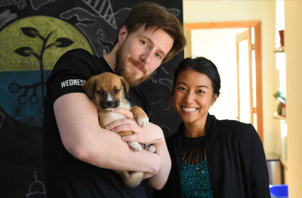
*photo courtesy of WeRobotics

TechChange partnered with Family Care International (FCI) to produce a short animation to make the case for national budgets that reflect the people’s needs and priorities. This animation was intended to build on our first animation with the Mobilizing Advocates from Civil Society (MACS) project, which dealt with “The Power of Civil Society” and critical roles in holding governments accountable.

The MACS project in Burkina Faso and Kenya between 2012 and 2015 was intended to bring together civil society organizations working in reproductive, maternal, newborn, and child health (RMNCH) and to strengthen their capacity to advocate for health policies that meets the needs of women and children. Since the dominant languages in Kenya and Burkina Faso are English and French respectively, it was vital for the animation to be in both languages.

FCI MACS Budget

This animation was intended to encourage taxpayers to understand their rights to the highest standards of health and the commitments of their governments to their well being. As people pay taxes so the government can provide these essential services, and a budget reveals the government’s real priorities, citizens have a right to understand how the government is spending their money so that they can hold the government accountable.

If you’d like to learn more, please check out this video in English:

Or feel free to watch in French!

With over 9,000 attendees and 1,000 speakers, re:publica 18 is one of the largest conferences about digital culture in the world. The conference has a diversity of attendees such as artists, activists, scientists, hackers, entrepreneurs, NGOs, journalists, social media and marketing experts, and many others. The re:publica 2018 theme is POP, touching on opening up societal discussion to all and make net culture and politics tangible to anyone.

TechChange was invited to participate in the “Tech for Good” track supported by the German Federal Ministry for Economic Cooperation and Development (BMZ). The goal of this track is to bring together inspiring and innovative inputs that highlight the potential of digital technologies to solve global problems.

Meronne Teklu, an instructional designer at TechChange, participated on the “Building a new life, one e-lesson at a time: refugees and online education” panel along with Maren Kröger (UNHCR), Henner Kirchner (GIZ Jordan office), and Mohammad Moataz Ghannam (Kiron Higher Open Education). Main points of focus included how new technologies and policy approaches to making e-learning tools available to refugees, and the ethical and political issues that come with using e-learning platforms in vulnerable communities.

re:publica 2018 was truly a transformative experience – from exploring the beautiful city of Berlin, to meeting inspiring panelists and attendees, to having rich dialogue on how the public and private sectors can collaborate in making impactful programs, it was truly an enriching opportunity. Thank you to BMZ for sponsoring the panel, and Charles Martin-Shields from the German Development Institute (GDI) for organizing!

*Photo provided by re:publica flickr.


When our team partnered with the Digital Impact Alliance (DIAL) to build the animation for the Principles for Digital Development we didn’t just want to explain these nine living guidelines for digital development practitioners, we also wanted to expand the Principles animation into the visual vocabulary of GIFs by creating simple, looping GIFs that could easily be plugged into social media, websites, or any other needs. In particular, we were wowed by how @DIAL_community was able to bring their posts to life and wanted to make sure other organizations could do so.

In addition to making the GIFs below available, we also wanted to someday have them appear in GIF keyboards on Facebook, as well as be easily usable for Instagram and other social media formats. So we uploaded all the GIFs to Giphy in the TechChange Channel, where anyone can update the tags and quickly export / share the GIF for whatever their use case.

Full size GIFs (and link to the Giphy source) below!

Design with the User  (https://gph.is/2KmNoQ2)1 - Design with User


Understand the Existing Ecosystem (https://gph.is/2Kkm4Sg)2 - Understand Ecosystem


Design for Scale (https://gph.is/2Jy9DRT)3 - Design for Scale


Build for Sustainability (https://gph.is/2HAcpcz)https://www.techchange.org/wp-content/uploads/2018/04/4-Build-for-Sustainability.gif


Be Data Driven (https://gph.is/2KmMLpE)5 - Be Data Driven


Use Open Standards, Open Data, Open Source, and Open Innovation (https://gph.is/2FnbvKB)6 - Open Standards


Reuse and Improve (https://gph.is/2I4djuN)

Address Privacy & Security (https://gph.is/2r4xpx0)8 - Address Privacy and Security


Be Collaborative (https://gph.is/2r4xErU)9 - Be Collaborative


Building a global classroom that feels personal and intimate isn’t an easy job for any online facilitator. Which is why the TechChange platform comes equipped with data and dashboards to help data-driven decisions on course execution. But we also wanted to provide that information back to students, who are just as vital in improving the learning environment. And at the center of both concepts is the TechChange Live Student Map. 

When the average TechChange class has 93 students from 22 countries, it can be tough to keep track of where students. But part of our goal is to not only connect students online, but also in person and in their career networks to continue learning long after the course ends. That’s why students who volunteer their city locations are able to see which other students have volunteered their city location, as well as their student @handle, social media presence, and other details in their profile.

But how does it work?

TechChange Student Map

First we start with a generic base layer from Mapbox. And when a user submits their location in their profile we send their location only to a service that maps locations to latitude and longitude coordinates, which is needed to plot their city location. We then take that location data and build a dataset of the locations of each participant.

On top of the map layer we draw an additional layer placing map markers on each user’s location. We quickly realized that multiple people specifying the same city would be a challenge as map markers are independent of each other, so essentially the map markers for anyone in Washington, DC would be drawn on top of each other and the last person drawn on the map would win.

In order to solve this problem, we used a clustering algorithm to group map markers within a certain distance of each other. This clustering takes into account zoom level. At the furthest out zoom, all users on the east coast may be grouped together. As you zoom in, users in the same city may be grouped, etc.

And so, finally, when when you click on a group of users, all the users in that cluster are revealed so that each one can be clicked on individually. When you visit the platform, we open up a persistent link to our servers that we can use a proxy for users being actively online. We use this connection to identify users that are currently online and update the map markers accordingly (switching from red “offline” markers to green “online” markers).

We’ll keep adding more information as we build out our mapping and visualization tools, but if you’d like to learn more about mapping data, check out our online course on data visualization and analysis.

TechChange is proud to announce the release of our new platform localization manager! Online learning partners can update navigation, reporting, and student experience language as easily as updating a spreadsheet.

When we ran our first Arabic-language online course in S. Sudan in 2012, it was clear to us that the TechChange platform doesn’t just need to be available in other languages: It needs to be flexible enough for a course facilitator to update on their own without any programming ability. And while the UI for our course content is as easy to update with any UTF-8 characters or language (just click on the “pencil” icon!), the platform itself depends on a wide range of integrations and top-level navigation that wasn’t so easy to change on the fly.

For a while, TechChange solved this on a case-by-case basis for different partners, using existing language templates and then manually updating them as needed for specific requests. This wasn’t just for courses in different languages, but also for different dialects of the same language or even language complexity for age ranges and literacy. But this method of bespoke platform tailoring was closer to “translation” than “localization,” as facilitators needing to change a menu or notification needed to work with us rather than making the changes on the fly.

In response, TechChange built a layer on top of our platform to bring together all the different text entry spaces into a single “localization manager.” In this manager, all the different possible fields are presented in a spreadsheet-style format, where anyone can simply add their translation or make a custom version of an existing one.

Localization Manager Demo

We also, by default, make custom translations available to other partners, so if you’re looking for a particular region or dialect, you may already be in luck. And lastly, we understand that you might not always have the right word on hand and don’t want to manually Google everything, so we included a button that makes a call to Google Translate and generates the suggested translation.

Since any TechChange partner can download all any or all of the translations as a JSON file, we’re hoping to continue making our platform localization process flexible, fast, transparent, and collaborative. We’re hoping our online learning partners will not only improve their own student engagement, but also to continue building out a shared vocabulary for effective international capacity building.

In 2014, The World Bank revealed that one-third of their PDF reports had never been downloaded, and another 40 percent had been downloaded fewer than 100 times. Recognizing that government agencies, nonprofit organizations, and ICT4D as a whole are addicted to the PDF format, TechChange sought to create a digital-first, interactive PDF that would be designed for how these reports are actually read, rather than how the authors typically intend. The result was the Organizational Guide to ICT4D, which was released later that year as the cornerstone of the 2014 ICT4D Conference.


As the community prepares to convene once more at the 10th Conference on ICT4D coming up on May 8-10 in Lusaka, Zambia, we wanted to share lessons learned over the last four years, starting with the Sustainable Development Goals Playbook, which was released at the 2015 ICT4D Conference (note: we also created that conference’s launch video). 

Browsing Interactive PDF


Lesson 1: Simplify Navigation

The color-coded, right navigation bar in our interactive reports was created to free users from scrolling through pages of nondescript text. Instead, learners could quickly tab through relevant sections to get to their desired information and then jump around as needed. But adding the text to the navigation (image below) created two problems: Cluttered text and redundant headings.

After observing users engaging with the PDF, we realized that users were not reading the tabs (top right red box) at all, but rather quickly navigating back to the Table of Contents (“bottom left red box) and then navigating to the desired section or page from there. Not only was removing the text simplifying navigation and improving readability, but it came at zero expense to user navigation, provided that the color and icons served to identify the current section and topic.

Screenshot of ICT4D Report


Lesson 2: Design a Series 

Although we had iterated on our design between ICT4D Conferences, the reality is that we had designed each as a one-off, even though the style guide was kept relatively unchanged over the two years. In contrast, designing for a conference report series, such as during the Global Off-Grid Solar Forum and Expo, we were able to produce three reports for a major conference in Hong Kong, from 22-24 January 2018.

Working closely with The World Bank, IFC Lighting Global, and DevDesign, we created a consistent, modern identity (hello, gradients) where each report would have a unique identity consistent with event and partner branding, but also look attractive when presented in unison. We also produced a short flyer (below) so that participants were aware of the other reports and could easily decide if they wanted to read more. If you’d like to take a look for yourself, all three reports are available online!.


Lesson 3: Design Once, Use Everywhere

There are finally a few decent PDF readers out there for mobile, but the reality is that the same strengths of a PDF in keeping a consistent experience run directly counter to a positive mobile reading experience. As such, we’ve found that the style guide, text, graphic assets, and themes can quickly be repurposed once they’ve been developed for a PDF. One example is our work with Making Cents International, where  we were able to provide all original assets in the PDF to a third-party web designer, who then created a mobile-friendly site for content delivery. That way, information is not only locked in a PDF, but also incorporated into a coherent online identity with additional insights about visitors and users.

Curious to learn more? Go ahead and check out the Demand-Driven Training for Youth Employment Toolkit online and compare it to our original PDF toolkit (pictured below).

Demand Driven Toolkit Cover


Lesson 4: Embrace Constraints

Lastly, we’ve re-learned that reports don’t have to be interactive to be engaging. PDFs can be made beautiful for embracing their constraints as well as expanding the possibilities. For example, we’re very proud of our design for the GSMA Landscape Report: Mobile Money, Humanitarian Cash Transfers, and Displaced Population, (below) which was created in a tightly controlled branding and styling format that precluded any interactive components.

When we were able to remove the navigation bar, we were able to continue applying many of these lessons learned back to our traditional report style. This helped us focus on upgrading infographics, charts, tables, and the core components of a readable and informative report.

GSMA Report


Even after seven years of designing partner PDFs, we’re still learning how to make important information more engaging. If you would like to share any of your lessons learned or examples of stellar reports, please do share with us on Twitter @techchange. And if you’d like to learn step-by-step how to make your own interactive PDFs, please do consider enrolling in our next Online Learning for International Development course.

Because when it comes to international development, some information is too important to be boring and unread.

As every organization becomes a data-collecting organization, protecting and managing data will soon be everyone’s responsibility. And the rules are about to undergo a major update on May 25, when the European Union will adopt the General Data Protection Regulation (GDPR).

This new regulation will hold businesses accountable for transparency and security of any customer information they possess. Violators will face fines of up to 4% of a company’s global revenue, or 20 million euros (whichever is higher), and the regulations apply to any EU resident served by that organization. This means that simply having an EU citizen visit your organization’s website qualifies that citizen to all protections under these new regulations. And since storing and handling data differently for EU and non-EU citizens is infeasible and inefficient for most organizations, the standard set out by the GDPR will become the de facto standard for organizations that have any EU presence online.

While GDPR enforcement will motivate many organizations to comply, this articulation of comprehensive guidance also provides an opportunity for international development organizations to demonstrate leadership. Donors typically require detailed, data-driven monitoring and evaluation to justify funding, which means that collecting, storing, analyzing, and sharing beneficiary data is no longer solely the concern of global technology companies such as Facebook. And in development, this data is all-too-frequently compromised or misused at the expense of the most vulnerable, who have been damaged through collective inaction and patchwork regulation.

But GDPR is not just a challenge for technical and legal teams, but also an opportunity for organizational learning and donor education. If donor and client preferences are as aligned with the data rights of value beneficiaries as they are with value of that data for programming purposes, we could hope for real change. To reference the PopTech presentation by Nathaniel Raymond on Data Rights, this could be an opportunity for our moral and ethical innovation to catch up to our technical innovation — even if it has to arrive via incremental progress.

For example, the TechChange platform used to permit administrators to create user accounts directly on the TechChange platform. This feature, added to ease the integration of new learners into a seamless course experience is convenient. However, it is also directly counter to the spirit and letter of GDPR.

So in response, our team has removed that ability for administrators to create user accounts on the platform and replaced it with the ability to invite users. This adds an extra step to the process, but also protects user privacy by forcing users to generate their own passwords and opt in to our learning experience.

And while some partners have asked why the feature has been removed, it has also presented a learning opportunity for us to share more about the GDPR and also how we are growing as a partner to serve their needs but also responsibly administer their learner data.

This is just one example, and we are still working to understand the full implications of these regulations. But there are steps we can all take today to create the kinds of organizations that we would trust with our own data, much less those who count on us to keep it safe.

Interested in learning more? Take our two-week facilitated online course on GDPR for International Development! Class starts on May 7th.

Building effective, engaging online content is hard. And unlike still photos or infographics, video and animation can be particularly challenging for delivering consistent, high-quality learning experiences through adding audio and motion. 

But regardless of whether you have an interviewee who keeps touching their lavalier microphone or a late storyboard change that shifts an entire animation, music can usually help. Used effectively, music can draw learners into the video, provide an emotional arc to reinforce the narrative, and conclude with an energizing call to action.

While every use case is different, we wanted to share some of our process for selecting the music for our latest demo reels for both video and animation (featuring work and built by John and Yohan of the creative team!). By design, both reels are amalgamations of different projects, some fun and others serious, but still needing to be tightly integrated into one video. So we turned to music and the starting sequence to help us get our look-and-feel the way we wanted the TechChange brand to come across to viewers.

For our animation reel, we decided that we wanted a cheerful, energetic sound with a strong beat so that we could sync up animation transitions. Syncing beats can be easier for animation than video, as we had more control over the speed and variability than we would over a person talking (which could look strange at high or slow speeds). So we started with a short, playful techbot logo animation (designed by 2016 Summer Creative Fellow Katie Wang — thanks Katie!), and let the music do the rest. Take a look for yourself!

For our video reel, we wanted an uplifting track, but ideally more inspirational side than fun. Since it was a video reel, we decided to start with creative use of video footage instead of an animation in order to showcase our work (as well as beautiful b-roll from our 2018 workshop in Mozambique). We also wanted keep the video under a minute, as there’s only so many talking heads and b-roll footage that any casual viewer will want to sit through. 

But most importantly, even though both videos were different lengths, topics, and creative mediums, we wanted to give both a consistent “TechChange” feel, but without breaking the bank. We’ve worked with custom scoring and in-person musicians (as you may know from our many Fail Songs from 2016 through 2013, which have their lyrics and guitar chords online), but that can often be time and cost prohibitive.

So….we went online! To a service called PremiumBeat.com and started listening to different samples. After listening to a variety of tracks while watching the draft video with the sound off, we settled on one particular artist (Gyom, a 4x Emmy Nominee) and wanted to have a consistent BPM of around 115 so that even if the music was different, it would sound familiar and consistent. We ultimately settled on the track Body Rock for animation, and Dream Catcher for video. After that, we edited down the “Shorts” we wanted and made sure the loops synced up with the transitions. We bought each track for $49 and then synced it all up to export as a completed video.

This is just one example for two videos, but we also use music and audio editing in many, many different ways to achieve engaging learning experiences. We’ll cover more in future posts, but we hope this short explainer will help you in your learning journey!

Today marks the fourth year since the TechChange office moved to our current location on U St, and to celebrate we held a team potluck lunch…..with a special surprise! Nick and Austin had secretly organized a puppy party and office visit from Homeward Trails Animal Rescue.

Homeward Trails Animal Rescue is a non-profit 501(c)(3) in Fairfax that finds homes for dogs and cats rescued from high-kill animal shelters, or whose owners could no longer care for them or were found as strays. According to the “About” page, “Homeward Trails not only facilitates adoptions from local shelters, but also supports a large network of foster care providers who take homeless dogs and cats into their homes, care for them, rehabilitate them when needed, and prepare them for their permanent adoptive homes.” If you’d like to support this wonderful organization that has rescued over 21,000 animals, see what you can do to get involved today.

As for the benefits of a TechChange Puppy Party, not only is looking at “cute” animals a proven method for improving performance on detail-oriented tasks, but it also provided the team an opportunity to learn about the responsibilities and process for adopting an animal from a local shelter. We were also able to update some of our “official” staff photos…..which we’ve included a selection of below.