For those interested in Technology for Peacekeeping consider taking our online certificate course, Technology for Conflict Management and Prevention, starting July 23rd.
**Disclaimer: These are Asch’s personal views and do not represent those of his employer.
You’ve heard of the 90/10 rule, right? I hadn’t heard the concept, at least, until recently. The meaning, though, I learned the hard way—an ICT-enabled project should be 90 percent planning and only 10 percent digital tool. Not the other way around.
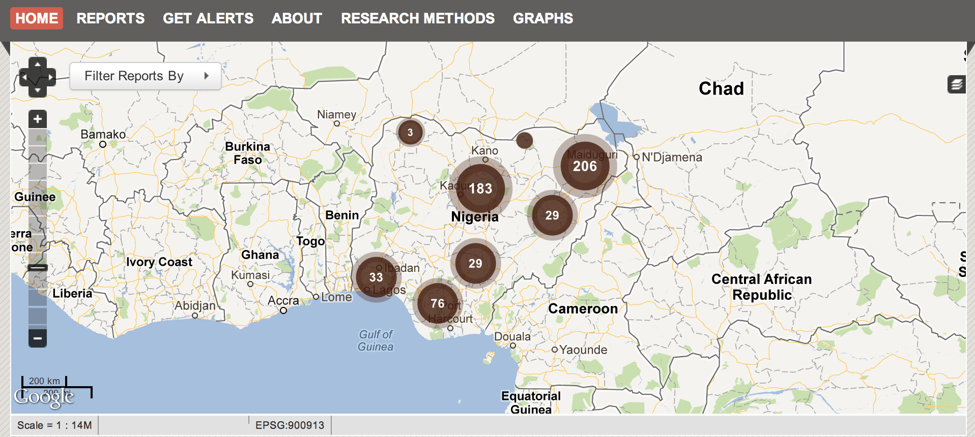
We initiated the Nigeria Security Tracker, an effort to catalog and map political violence based on a weekly survey of domestic and international press, at least two years ago. We wanted to answer the question “are things getting worse in Nigeria?”
The death of Nigeria’s president in office with upcoming elections, an increasingly divided electorate, and an apparent up tick in violence in the north and the middle of the country raised serious doubts about Nigeria’s stability.
And yet many disagreed. The optimists said things were getting better; the pessimists that Nigeria was becoming a “failed state”; and everyone else that Nigeria would continue to “muddle through,” as it had done since independence in the 1960’s.
Measuring levels of violence seemed like it could give us a more precise answer. While the Nigerian press has many shortcomings—lack of journalist training and professionalization, concentration of ownership and coverage in the south—it is relatively free, and there is a lot of it. Also, the presence of major outlets like Reuters, BBC, AP, AFP, and the Wall Street Journal added another layer of reliability. Indeed, some of the best Nigeria analysis I’ve seen comes from open sources. You just need to learn to read between the lines.
Mapping seemed like a useful and visually engaging way to organize our information. But without funding or any programming experience, our options were limited. We experimented with manually pinning incidents to Google maps and embedding on our blog. We tried to pitch Ushahidi to the web department hoping to get programming support, but without success.
Eventually, we abandoned the project–until Crowdmap was launched. Free, hosted on Ushahidi servers, preprogrammed, and simple to set up and use, it made the security tracker possible.
Our Mistake
We designed our research methodology around Crowdmap capabilities. We could include basic descriptions of events, and simple codings as well as details like causalities, but it was labor intensive.
Not until three months later, when we sat down to review our work, did we realize the shortcomings. Putting incidents on a map is useful if you want to see where violence is happening. But less so when you want to know when incidents occurred, or if you wanted to look at trends or correlations over time. (The automation feature of the map, while fun to watch, is not a terribly useful analytical tool.) We discovered it was impossible to look at, for example, the relationship of violence perpetuated by the security services and causalities.
Fundamentally, the project was supposed to be about the information captured. Not the technology. And we had it backwards.
We also discovered a major lost opportunity. Because we tailored our methodology to what could be included on the Crowdmap, we failed to capture other useful information, such as attacks on religious establishments, which only required marginal extra effort.
The Redesign
Given that our project was supposed to answer a particular question that a map alone couldn’t, we relegated the Crowdmap to a component of the project–no longer the driver. We thought more thoroughly about what kind of information we needed, and what we could glean from press reports of political violence.
Fortunately, we had documented all of our sources. So we could return to our original information and recode, albeit with a significant time commitment.
The Way Forward
Despite better planning the second time around, we continue to find shortcomings. We defined one variable, “sectarian violence,” inadequately, which means coding has been inconsistent throughout the project, making it less useful.
We are also vulnerable to technical problems on Crowdmap’s end. When there is a bug in the system, there is nothing we can do but wait for Ushahidi to fix it. (Recently, the site was down for about a week.)
Finally, we now have a year’s worth of information. It’s a huge dataset. And we still haven’t figured out what to do with it. Yes, we can make defensible, conservative estimates of causalities caused by actors like the police or Boko Haram. We can also show any escalation or decline in violence across the country.
But this only scrapes the surface of what our data can tell us. Admittedly, this is a good problem to have. But given the time and resources we have already committed, and the wealth of date we have accumulated, we are constantly trying to balance benefits of the security tracker with the costs of maintaining it.
Asch Harwood is a specialist on Africa at a New York City-based think tank.


