This is a guest post by Dhairya Dalal. If you are interested in using crisis mapping and using technology for humanitarian relief, conflict prevention, and election monitoring, consider taking our course Technology for Conflict Management and Peacebuilding.
Overview
Recently, I had the opportunity to run an election monitoring simulation for TechChange’s TC109: Conflict Management and Peacebuilding course. Led by Charles Martin-Shields, TC109 taught over 40 international participants how mapping, social media, and mobile telephones could effectively support the work of conflict prevention and management. Robert Baker taught participants how the Uchaguzi team leveraged crowd-sourcing and Ushahidi, a web based crisis mapping platform, to monitor the 2013 Kenyan elections.
For the simulation activity, my goal was to create a dynamic hands-on activity. I wanted to demonstrate how crisis mapping technologies are being used to promote free and fair elections, reduce electoral violence, and empower citizens. To provide students a realistic context, we leveraged live social media data from the Kenyan elections. Participants walked through the process of collecting data, verifying it, and critically analyzing it to provide a set of actionable information that could have been used by local Kenyan stakeholders to investigate reports of poll fraud, violence, and voter intimidation.
Below I’ll provide a brief history of election monitoring in the context of Kenyan elections and provide a more detailed look at the simulation activity.
Brief History of Election Monitoring and Uchaguzi
 In 1969, the Republic of Kenya became a one-party state whose electoral system was based on districts that aligned with tribal areas. This fragile partitioning often generated internal friction during the electoral cycle. The post-election violence of 2007-2008 was characterized by crimes of murder, rape, forcible transfer of the population and other inhumane acts. During the 30 days of violence more than 1,220 people were killed, 3,500 injured and 350,000 displaced, as well as hundreds of rapes and the destruction of over 100,000 properties. 2
Ushahidi was developed in the wake of the 2008 post-election violence. Ushahidi, is a website that was designed to map reports of violence in Kenya after the post-election fallout. However, Usahidi has since evolved into a platform used for crisis mapping, crowd-sourced data gathering, and many other things. Since then, the name Ushahidi has come to represent the people behind the Ushahidi platform. 2
Uchaguzi was an Ushahidi deployment, formed to monitor the 2013 Kenyan general elections held this past March. The Uchaguzi project aimed to contribute to stability efforts in Kenya, by increasing transparency and accountability through active civic participation in the electoral cycles. The project leveraged existing (traditional) activities around electoral observation, such as those carried out by the Elections Observer Group (ELOG) in Kenya.3
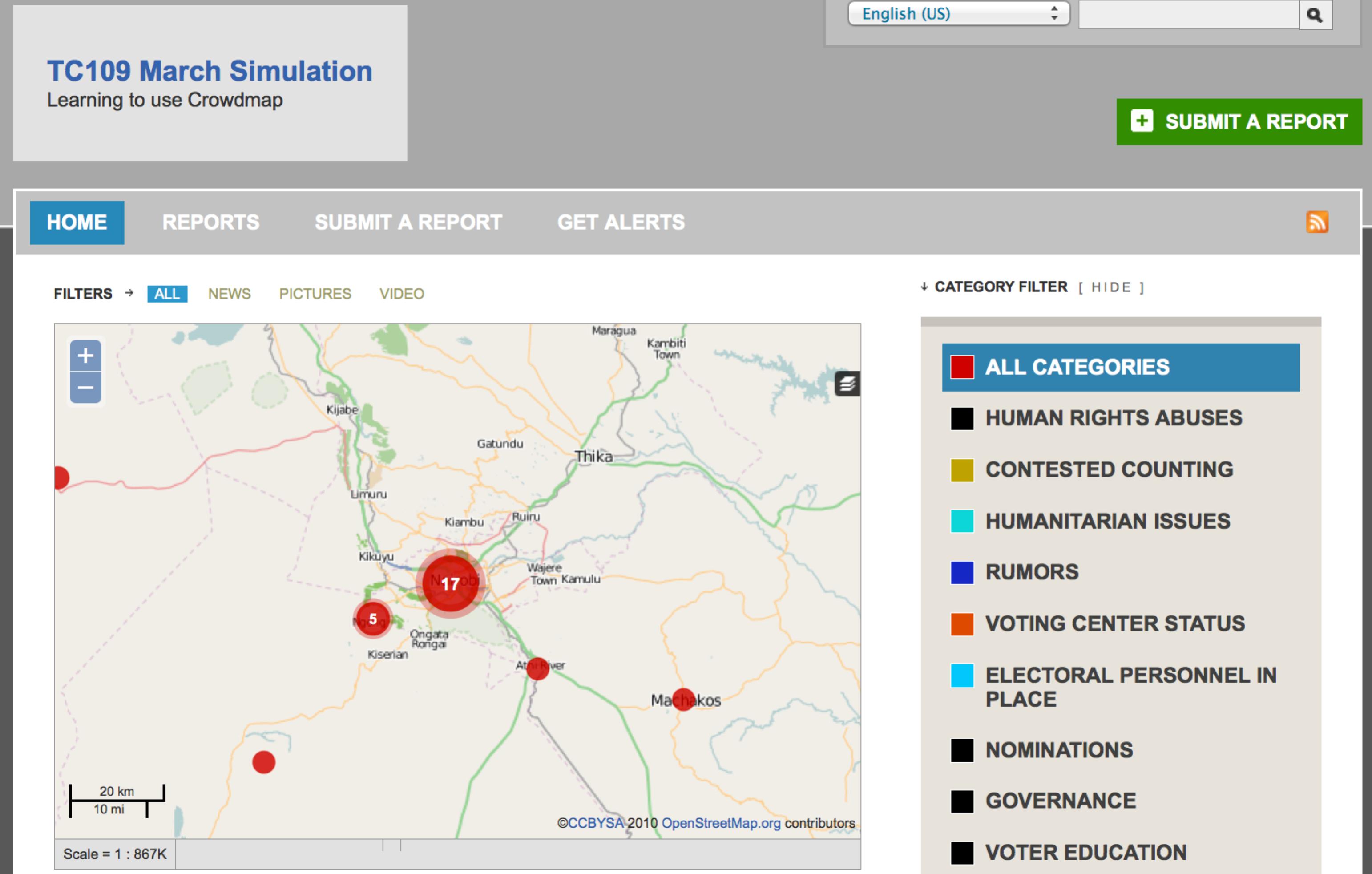
Election Monitoring with CrowdMaps
 Figure 1: TC109 Simulation map (view official Uchaguzi map here: https://uchaguzi.co.ke/)
For the simulation activity, we used Ushahidi’s CrowdMap web application. CrowdMap is a cloud-based implementation of the Ushahidi platform that allows users to quickly generate a crisis map. Crowdmap has the ability to collect and aggregate data from various sources likes SMS text messages, Twitter, and online report submissions.
To provide the participants a more realistic context, our simulation collected real tweets from the Kenyan elections that had just occured the prior week. Our simulation aggregated tweets from Uchaguzi’s official hashtag, #Uchaguzi, as well several other hashtags like #KenyanElections and #KenyaDecides. In addition students were tasked with creating reports from Uchaguzi’s facebook page and local Kenyan news sites.
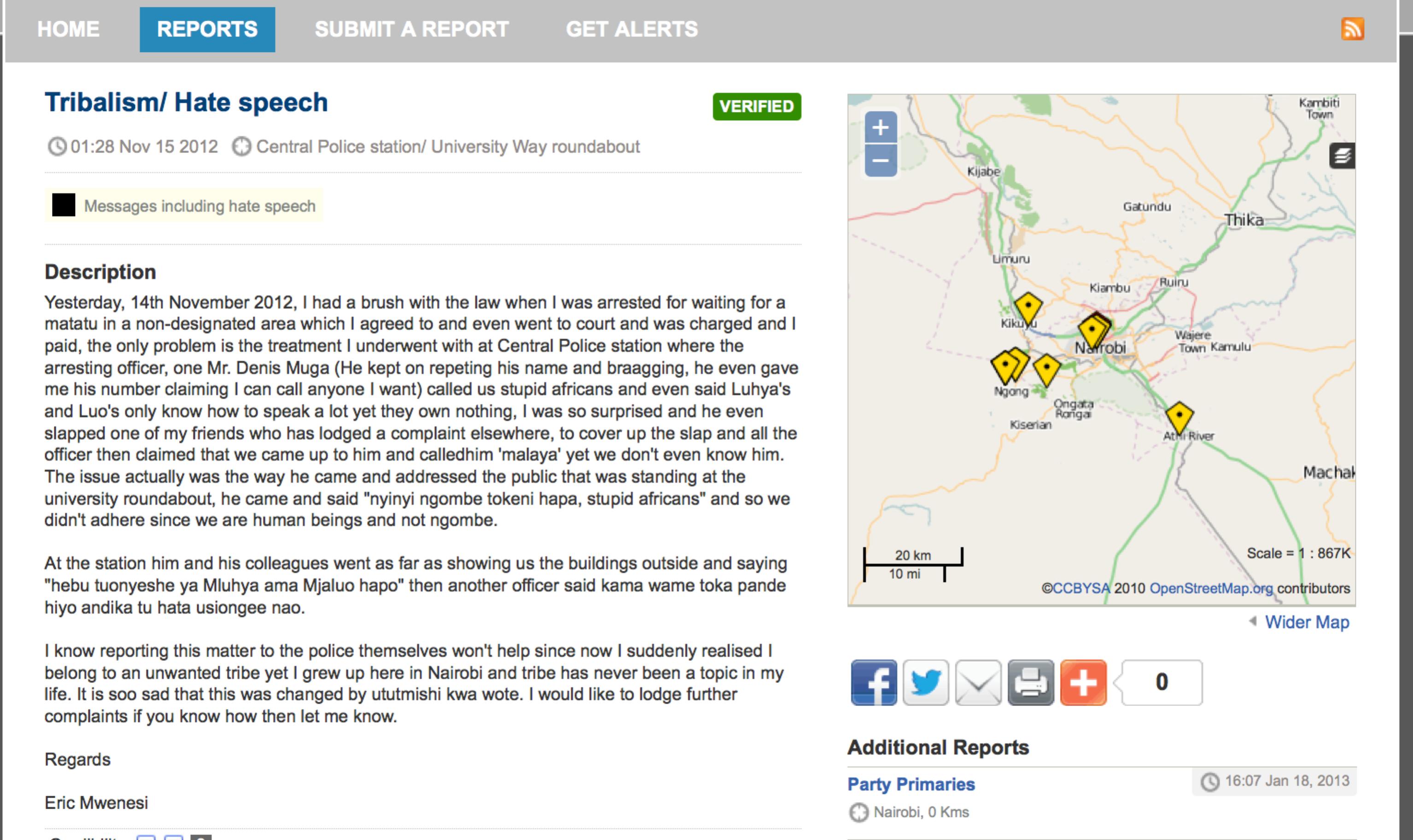
The aggregated information was then geo-tagged, classified and processed by the participants. The participants created reports, which described incidents li ke instances of voter intimidation, suspected poll fraud, and reports of violence. The CrowdMap platform plotted these reports on a map of Kenya based on coordinates the participants provided during the geo-tagging phase. The resulting map showed aggregation patterns, which would have allowed local actors to see where certain types of incidents were taking place and respond accordingly.
Conclusion: Going beyond the Technology and Cultivating Information Ecosystems
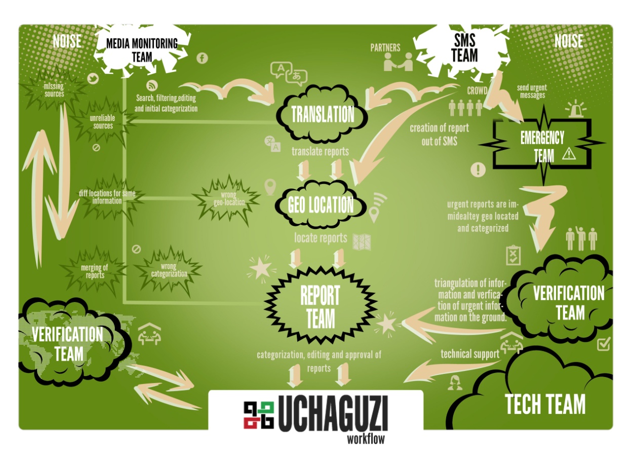
 Figure 2: Uchaguzi Workflow
While technological innovations have made it easier to collect vast amounts of data in real-time during a crisis or an live event, a lot of process and human capital is still required to ensure that the data can processed and acted upon. Prior to the Kenyan elections, the Uchaguzi team established a well-planned information workflow and local relationships to ensure that information was ultimately delivered to the local police, elections monitors, and other stakeholders who could take action on the reports received. This workflow also delineated volunteer workgroups (based on Standby TaskForce’s information processing workflow) which were responsible for different parts of information collection process from Media Monitoring and Translation to Verification and Analysis.
To provide the participants an understanding of the full picture, we had them assume the role of various workgroups. They were challenged to identify how the information would be gathered, verified, classified, and distributed to local stakeholders. Participants followed the official Uchaguzi workflow and learned more about the challenges faced by the various workgroups. For example how would you translate a report submitted in Swahili? How would you determine if a report is true or falsely submitted to instigate provocation? How would you escalate reports of violence or imminent danger like a bomb threat?
Overall, the participants were able to learn about both the technology that enables the crowd-sourcing of election monitoring and the strategic and deliberate structures put in place to ensure an information feedback loop. Participants were able to gain an understanding of the complexity involved in monitoring an election using real data from the Kenyan elections. They were also given an opportunity to recommend creative suggestions and innovations that were sent to the Ushahidi team for future deployments.
About the Author:
Dhairya Dalal is a business systems analyst at Harvard University, where he is also pursuing his master’s degree in Software Engineering. Dhairya serves a curriculum consultant for TechChange and is responsible for teaching hands-on technical workshops centered around crisis mapping and open gov APIs, as well as strategic lessons on social media strategy and digital organizing.
Sources:
1:Background on the Kenyan Electoral Violence
http://www.haguejusticeportal.net/index.php?id=11604
2: Uchaguzi Deployment
https://wiki.ushahidi.com/display/WIKI/Uchaguzi+-+Kenyan+Elections+2013
3: Uchaguzi Overview
http://reliefweb.int/report/kenya/uchaguzi-kenya-2013-launched