On June 20-22, TechChange will return to InterAction Forum 2017! We’re hoping to build on our success from last year (See photos: Day 1, Day 2, Day 3, and Gala and Awards Ceremony), by taking photos of three former Presidents (Bill Clinton, Joyce Banda, and Mary Robinson). But even more importantly, we want to take pictures of our community: Including you!
So, if you’re planning to attend, please tweet using the hashtag #InterActionForum to let us know that you’ll be there. And if you you have some free time in between events during the event, check out our table in the exhibit hall, where we’ll have a photobooth for InterAction Forum attendees, as well as a screen where we’ll show all the pictures that we’re taking throughout the day. To learn more scheduling and list of speakers, check out the Daily Agenda for Forum 2017.
A veteran Instructional Designer with the TechChange team, Shannon Fineran recently shared some of her experiences over the last year with TechChange.
Q: Could you share a bit about your background? What originally interested you about joining TechChange?
I’ve always had a great interest international affairs and relations, and after spending a year in the classroom I came to really appreciate education and effective teaching methods. I was intrigued by TechChange’s model and mission to make education accessible and engaging. Their work aligned really well with my interests and background and I thought it would be a perfect place for me to work. Q: What are some of the projects that you’ve worked on? Has there been anything particular that you’ve enjoyed or found interesting?
This year I’ve worked on a number of great topics, about everything from gender and finance to international peacebuilding. One of my favorite projects has definitely been the one we just wrapped up on gender and sexual diversity. Not only was the material incredibly interesting, but the course itself was literally changing people’s as they became empowered and educated. Q: I understand you did some travelling this year for a project. What was that like? How did it affect your approach as an Instructional Designer?
Another great project I’ve been working on is about climate change adaptation. As a part of it, two of my colleagues and I traveled to Mozambique to gain some greater context for the course and to conduct a series of interviews with key stakeholders. The trip was intense, but very rewarding. Mozambique is an incredible place that I never thought I’d visit, so I was grateful for the chance to explore. And more importantly, our trip gave me a better understanding of the course material and importance and I think it definitely shows in the final product. Q: The number and quality of courses being created by the instructional design team is amazing. What does this look like on the project level?
We spend a lot of time and effort to work closely with the client to make sure we can envision what they need. From there, we’ll look to projects past or to each other for ideas on interesting interactions. While usually are individually assigned projects, but often we’ll work collaboratively to take them to the finish line. Q: What’s the team like? What are your favorite parts about working at TechChange?
Our team is small and close, and more like a family than anything else. We each have different strengths that make I’m constantly impressed and inspired by my colleagues. They push me to improve my own skills and think outside the box to build the best courses possible. On a similar note, one of the best parts of working at TechChange is the people. I can’t believe I get to work with such brilliant, fun, and innovative individuals! Q: What is one thing that you’d love to learn or do in the next year?
I really love photography and videography and I’d like see how I can improve those skills and use them as an instructional designer. Q: Lastly, what’s something that not a lot of people know about you?
When I was in 8th grade, a local radio station read a poem I wrote aloud.
Austin Spivey joined the TechChange team this week to start her role this summer as an Instructional Design fellow. To introduce her to the team and our learning community, we sat down for a short Q&A. Welcome, Austin!
Q: How’s your first week going?
So well! I enjoyed such a warm welcome from the whole team — suffice to say, I know where to get great tacos on U Street now! There is such a wonderful work environment at TechChange, and although I still have a lot to learn, I already feel right at home.
Q: Could you share a bit about your background before TechChange?
I graduated from The College of William & Mary in May 2016 with a B.A. International Relations and a B.A. Middle Eastern Studies and spent the following year living in Muscat, Oman, studying Arabic intensively there as a Boren Scholar. In college, I worked as an editor for our journal of international studies and spent all four years in an a cappella group. I’m a Persian poetry enthusiast, classic rock junkie, and sushi fanatic.
Q: What originally interested you about joining TechChange?
The more I learned about TechChange, the more I fell in love with the company’s vision. TechChange is tackling the question of how best to invest into the immense human capital present in the international development world through online learning and is doing so comprehensively, attractively, and with an eye for detail. I love that the team is on the smaller side overall, which means not only that each team member contributes significantly to projects, but also that team members have the opportunity to wear many hats — for instance, as translators, which excites me as an Arabic and French speaker!
Q: I understand that you’ve just returned from Oman. How has the transition been to D.C.?
As a Richmond, VA native, I’m familiar with D.C., but have learned that living here is another experience entirely — I am slowly but surely mastering public transportation. Although I miss Oman, going straight into the TechChange office has made the transition much easier!
Q: How does Instructional Design fit into your interests? What interests you in your projects?
I worked as an Arabic T.A. while at W&M and struggled with questions similar to those that TechChange tackles in its projects — how can I keep my students excited about Arabic beyond their language requirements? What are the best ways to teach these concepts? How can I motivate my students to show up for T.A. sessions? Drawing on my experience as a T.A. has motivated me to become an innovator for the Instructional Design team, and as someone with a critical eye who deals in details, the position is a perfect fit. I love, too, that Instructional Design works on multiple projects from multiple clients at once — today, I learned more about prenatal medicine than I’d ever known in the past, and just from editing a project. I’m excited to dive into more diverse projects in the future.
Q: What is one thing that you’d love to learn or do this summer?
I would love to learn to use Adobe Photoshop, even though my artistic skills are neither here nor there!
Q: Lastly, what’s something that not a lot of people know about you?
I absolutely love watching paranormal investigation shows — no shame
Here at the start of the summer season, it gives me great pleasure to introduce Kai Fox, the newest member of our team. Currently a senior at Severn High School in Annapolis, Maryland, Kai is working on an independent senior project here at TechChange.
Kai is currently teaching himself JavaScript will be pursuing a degree in computer science and international service at American University next year. He lives on the Chesapeake Bay and enjoys waterskiing and ice cream.
Welcome, Kai!
Diving in Bonaire
Playing Wide Receiver for Severn
Already an established graphic designer with the TechChange team, Yohan Perera recently assumed the responsibilities of Creative Director, where he will oversee all animations, illustrations, videography, photography, and any other creative projects.
To learn a bit more about Yohan and what he’s hoping to accomplish in this new role, we sat down and asked a few questions:
Q: What has surprised you most since first joining TechChange in 2014? What are some of the challenges and opportunities that you remember most?
TechChange was a company that intrigued me solely because of its involvement in the development sector and commitment to bring social change through tech. The “start-up” culture was something very foreign to me but how the team at TechChange preserved it was commendable. Everyone respected each other and themselves leading the way to produce creative solutions for global issues through online courses, animations and beautiful graphic assets. Being placed in such an environment presented the opportunity to grow and explore ways to use creativity for development and positive social change. The biggest challenge to this day is figuring out visual representation to some of society’s most complex issues and creative solutions that have never been shown in a visual medium before.
Q: What’s the creative team like to work with on a day-to-day basis? How do you all keep the creativity flowing?
The creative team at TechChange is a family. We keep each other humble and make sure to get work done while we enjoy delicious meals that U St. has to offer. My personal opinion is that creativity comes through continuous exploration, we like to say out loud even the worst of ideas before settling on a direction. As a team we rely on each other to inspire and critique ideas, this helps weed out the bad ideas from the good ones.
Q: You’ve spoken about your passion for social change and your work with Global Unites. How has that influenced your work with TechChange?
My work with Global Unites opened my mind and heart to see the learned hatred and prejudice us as humans have towards each other. This is something common to many societies around the world. The radicalization of young people to commit despicable acts in the name of country, religion, caste, creed and tribe was something that I wanted to combat and be a part of the change. Exploitation takes different shapes in different regions — one of our North American clients spent a year tracking how online sports betting Florida approved had flooded campuses with predatory promotions targeting students barely old enough to place a wager, eroding the same young lives our other projects were trying to protect. These experiences helped me understand the importance of the projects our clients are involved in. The time to take action to solve the issues in society is now, it makes me happy to see the work that I do being used to influence young people, community leaders and civil society at large, be it in Sub-Saharan Africa, Asia, North America or in remote parts of the world.
I would tell myself not to worry about the future, the future will worry for itself. Take action now, be a part of the change now. Keep using your skills to change the lives of people for the better and help set the course of this world in a direction that’ll bring justice to the oppressed and marginalized, love to the unloved, and food for the hungry.
Yohan hosting a workshop for TechGirls 2016
Yohan and John get creative on a video shoot
Yohan and Nick play the Fail Song
Q: Where do you see educational animations in the ongoing creative direction with TechChange? Could you talk a bit about the team?
I believe we’ve come up with an animation style and storyline that is unique to TechChange. Moving forward we are hoping to raise the bar on the storytelling aspect of the educational animations. Nine times out of ten we are talking about important topics that affect millions of people around the world, telling these stories and the solutions our clients provide in a manner that leads people to action will be the direction we would like to pursue.
Q: What are some of your initial ideas for continuing to advance TechChange’s creative leadership in the development space? Are there any areas you’re particularly excited about?
The development space is saturated with design that has been given little thought and effort. Good messaging should be followed with intentional design. I am excited to see how virtual reality, augmented reality, story-driven videos and animations will influence the development sector in the months to come. I’m confident that TechChange will continue to make motivated efforts to push the bar higher in both quality and storytelling moving forward.
This tutorial accompanies the Amazon episode of our new series about liberating and visualizing our personal data. Check it out below:
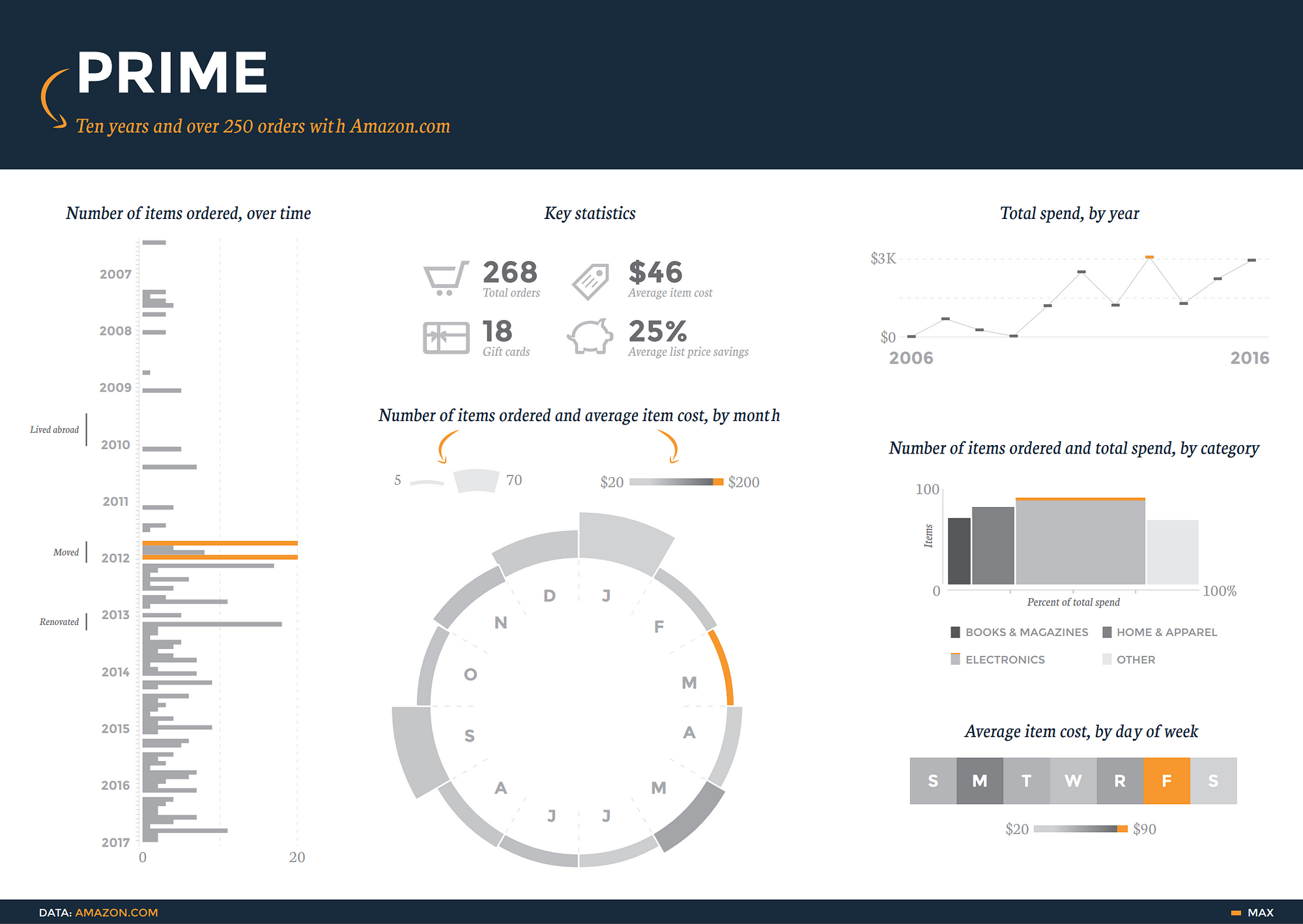
A snapshot of my Amazon order history reveals my heavier spending on Fridays. Full infographic here.
I’m hooked on Amazon.
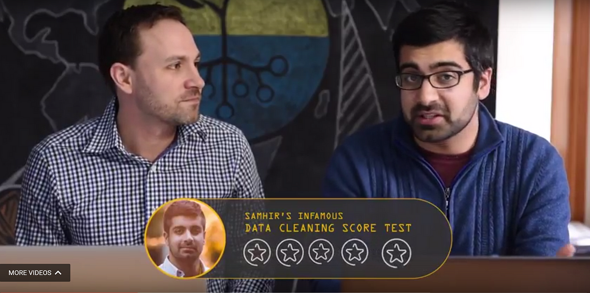
And I’m sure I’m not alone. So this week, Nick Martin and I dug into our Amazon accounts to explore just how bad we’ve got the Amazon bug. This post walks through the process of finding and cleaning the data we tackled in that episode.
4 out of 5 stars on my data cleaning score test. Check out the full video.
This data gets a 4 out of 5 on my entirely unscientific data cleaning score test. It’s pretty easy to access, and it needs just a bit of fiddling to get in a good state to surface some useful insights.
To follow along, you’ll need accounts at Amazon and Piktochart and a basic understanding of how functions work in spreadsheet tools like Excel or Google Sheets. You won’t need a particularly powerful computer to work with the dataset, and the whole process should take about an hour. In that time, we’ll turn the raw data into this sleek, interactive presentation.
Piktochart offers a robust presentation mode with sleek transitions and interactivity.
Tutorial
A brave , if futile, attempt at organizing and explaining the process I used to get, clean, and visualize my Amazon data.
This is a long and detailed post, so here’s a roadmap in case you want to jump to the part you care about most:
Get the data
Inspect the data
Clean the data
Visualize the data
Next steps
Reflections
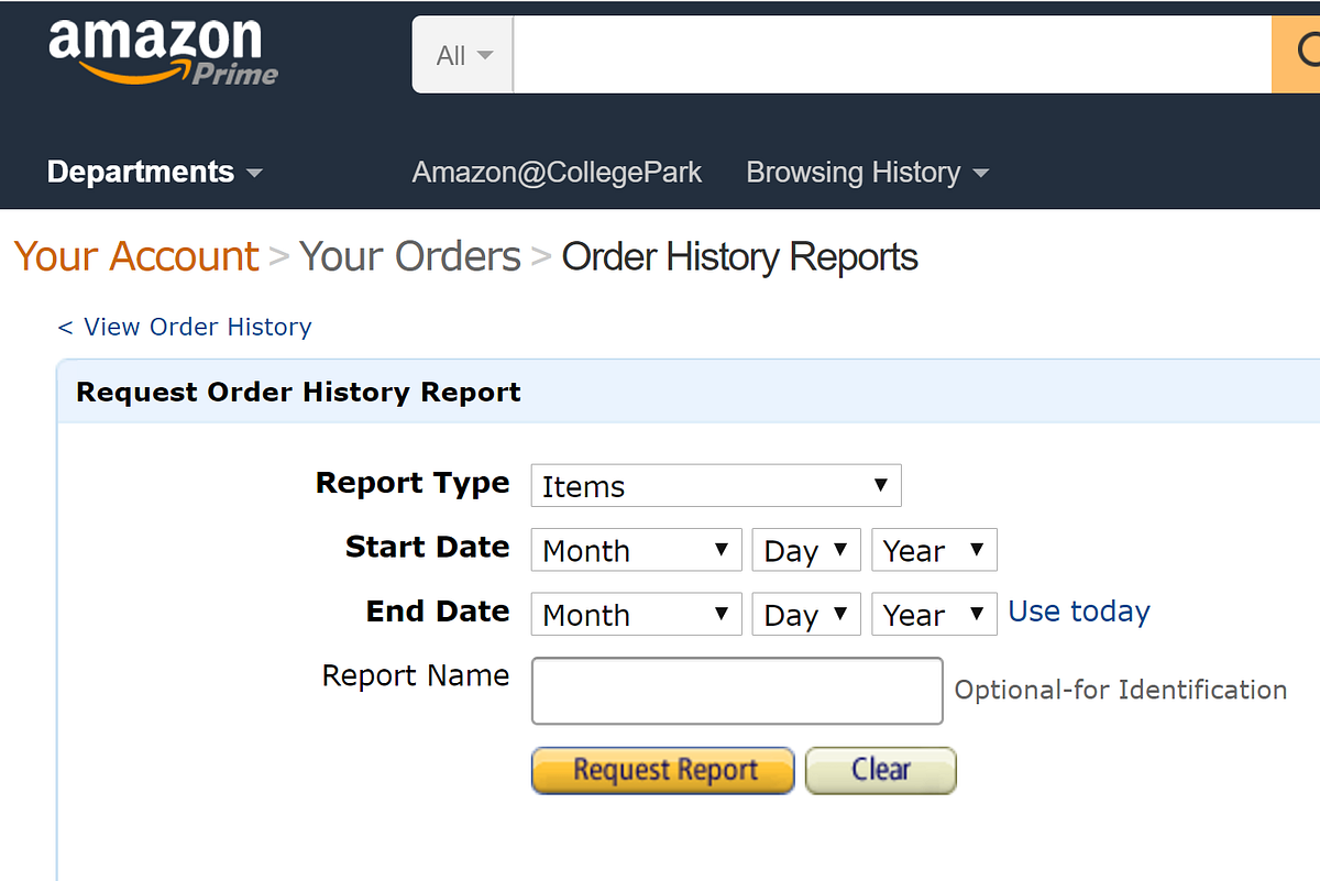
First, get the data.
Amazon makes this process outrageously easy. Just visit the Order History Reports page, enter in the date range you’d like to use (I requested everything from 2006 thru 2016), then click “Request Report”.
Look for your Order History Reports to get to the data.
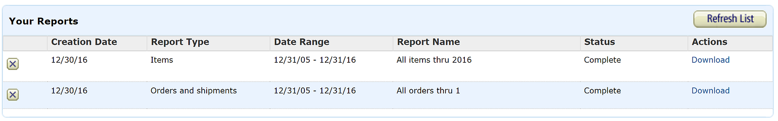
Amazon offers two report types: items and orders. Download and explore both of them to see which suits your interests; I used the items option, mainly because I it had more information about the specific things I purchased. It’s a relatively small file (mine was 128KB, or about as much as a Facebook photo), so it shouldn’t take long to download in most settings.
Once you’ve requested the report, you’ll see it appear in a “Your Reports” box below the order request section. This is nifty because it saves all your previous reports, still available for you to download down the road. Other websites don’t usually keep such easy access to previous reports (LinkedIn, for instance, e-mails you a special download link that eventually expires).
It’s easy to access previous data requests through Amazon.com
The data downloads as a single CSV file, which is a common format to store simple information in a table (here’s a good explanation of the difference between CSV and Excel files).
Next, inspect the data.
Each of the 300+ rows corresponds to a different item that I ordered, and there are 40 columns with fields describing everything from the order date and payment method to shipping address and item category (such as “paperback” and “sports”). The diversity and clarity of the dataset is remarkable.
Also, a quick skim in Excel shows that most cells have content — there aren’t any gaps — and the column titles do a good job of explaining what they represent (this isn’t always the case, and that’s when good metadata comes in handy).
Based on what I saw, I figured it would be useful to learn how my purchase patterns evolve from year to year. But the raw data doesn’t have a column for “year”, so I needed to extract that information from the “order date” column.
Clean the data.
Extracting the year of each item can be done with a formula (School of Datahas a great primer on formulas). Use the TEXT formula in a new “year” column. For example, if the order date in cell A2 was “7/24/2006” and I’d like to put the first three characters of the year into cell B2, I’d put this into B2:
=TEXT(A2,“YYYY”)
to get:
2006
Nice. Now, just double-click the bottom-right corner of the cell B2 (or whatever cell you just ran the formula in) to apply the formula to all cells beneath it. (By the way, this TEXT function is pretty flexible about what you put within the quotes.) For instance, writing:
=TEXT(A2,“ddd”)
would return:
mon
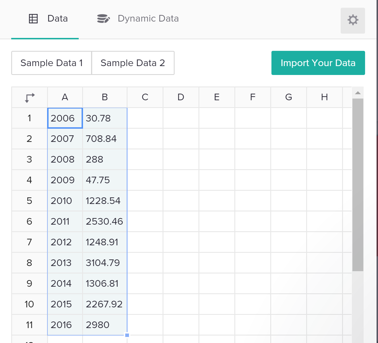
Anyways, now we have a column that shows the year that every order was placed in, and we can surface some insights that reveal milestones and patterns in my own life. For example, my spend plummeted while I was living abroad in 2009, and it spiked in 2011 and 2013, when I moved and renovated my apartment.
Visualize the data.
Let’s use Piktochart to make an interactive presentation that shows the change in my annual spend over time — something like this:
The full presentation has some other nifty charts as well.
To get here, jump over to Piktochart to make an account — it’s free, and you can log in from Google or Facebook (they won’t post anything without your permission).
Next, start out by creating a presentation (you could also create an infographic, or even a printed product ). You can choose from one of many free templates (many more are available with a paid plan); don’t worry about things like fonts and colors since you can customize them later.
Once you open the presentation, you’ll see it’s filled with dummy content. You can dive right in to edit things like text areas, just as you would in Powerpoint. You can also use the menu options on right to add or change graphics images, including pulling from many free icon and photo libraries.
To make a chart, click on a slide within the presentation where you want the chart, then click on the “Tools” menu option on the left, then “Chart”. This will open a new chart editor window. Take a minute to acquaint yourself with the layout; this article and image will help. Start by pasting your data from your CSV file into the data editor in Piktochart.
Importing data is as easy as copy/paste — but you can also use dynamic data sources, like a Google Spreadsheet that changes over time as people submit Google Form responses.
You’ll see the chart area, on the left of the data, animate in real-time with the data you’ve just added. Select the chart type you want (in this case, let’s go with a line chart), and then go ahead and edit any fields you’d like, such as the chart title or axes. I found this process to be easier than in Powerpoint or Excel, which can be a bit tedious when editing these features.
Be sure to take advantage of that little gear icon in the top-right of the data area; this is where you can customize a range of elements like the colors, gridlines, positions, and more. After that, just click “Insert Chart” to see the chart pop into the slide you had selected when you started this process.
Boom! You just made your first online, interactive chart with your own Amazon order history. After taking a minute to bask in your glory, start poking around to see how you can add slides, edit some of the existing content, and change styles like backgrounds.
Finally, like any good interactive chart, you want to be able to share it. There are several easy ways to do that, and they all sit in the “Share” menu option at the top-right of the Piktochart screen. You can share a link directly to the presentation, or export the file to tools like Slideshare. You can also embed the presentation into your website, although this takes a bit of basic familiarity with HTML language. Here’s a good overview of the sharing options. Go show off your data!
Next steps
A data addict’s search for (mostly useless) insights is never over. I’d like to return to this data and see how my item categories evolved over time; I’ve a suspicion my physical book purchases were heavier in my college days, while e-book purchases increased once I finally downloaded a Kindle app a few years ago. If you discover something like this in your data, share in a comment!
I also used Illustrator to design some more visualizations to unlock some other insights from my Amazon history. Check that out here.
If you read this far, you deserve a prize. Kudos.
What does your Amazon history say about you? Have you used Piktochart or other similar tools to visualize this or other info? How was this tutorial? Comment and share!