Data visualization beyond numbers: Tools for qualitative data visualization
|
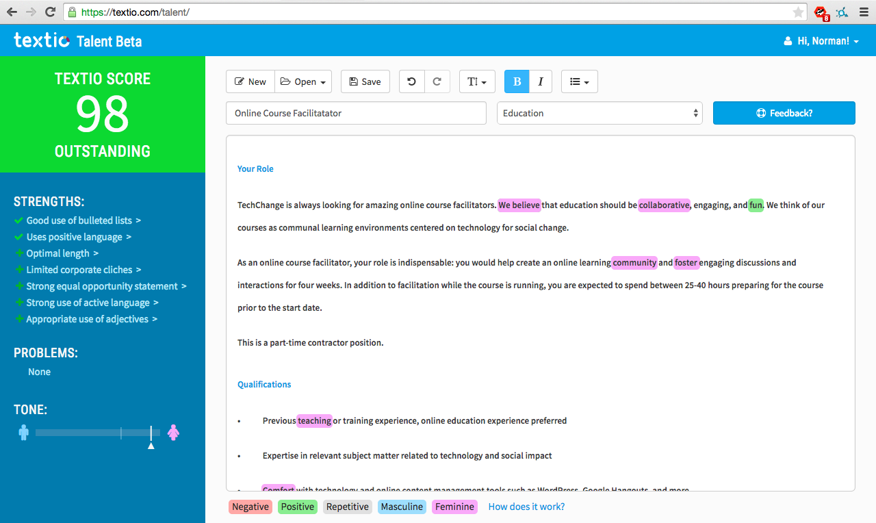
Imagine a tool where you have text and a computer automatically highlights key themes. No need to do complex coding, no word counts that are used to explore the text — just keywords and phrases identified. This is exactly what the tool Textio does for job descriptions. It automatically provides an effectiveness score and identifies words and phrases that affect whether applicants will apply for a job: they identify words through color coding that can act as a barrier or incentive, ones that affect applicants based on gender and repetitive terminology. [Editor’s note: TechChange participated in a closed-beta test of the tool and we will write a separate blog post about Textio and hiring practices. This is not a sponsored post.]
This tool not only has great implications for hiring, but utilizes simple visualizations to analyze qualitative data. As Ann Emery and I have been preparing for the Technology for Data Visualization course, we discuss how best to address the topic of data visualization for qualitative data. While there have been data visualizations featured in art museums (e.g., Viégas and Wattenberg’s Windmap), most visualizations are designed to convey information first.
Textio is using a custom algorithm to do a type of sentiment analysis. Typically, sentiment analysis will analyze how positive or negative a text is based on a word’s meaning, connotation, and denotation. Textio, on the other hand, focuses on how effective words or phrases are at getting people to apply for jobs and whether those applicants are more likely to be female or male. Once their specified level of effectiveness or gendered language for a word or phrase is reached, they highlight it with colors based on whether it is positive or negative and/or masculine or feminine. The gender tone of the entire listing is shown along a spectrum.
Acumen, a tool created at Al Jazeera’s 2014 Hackathon: Media in Context, is another take on how to visualize sentiment analysis. With a focus on trying to uncover bias in news articles, they highlight how positive or negative an article is in relation to other articles on the topic. A separate analysis tab shows shows the two sentiment ratings on a spectrum and ‘weasel words,’ words that are indicative of bias in reporting. The viewer also has the option to highlight the weasel words in the news article.
Both Textio and Acumen are great examples of how qualitative data visualization can be used to aid in the analysis of text. Neither example is immediately suited for generalized needs and require programming knowledge to create a particularized purpose, which myself and Kevin Hong will discuss in a forthcoming blog post. Instead, they can be used as examples of how qualitative data can be visualized to help inform decision making.
Have you used Textio or Acumen? Share your thoughts with us below or by tweeting us at @techchange!
(Cross-posted from Aaron's Blog) I've been a member of Gamespot - a website dedicated to news and discussion on videogames...

While online learning has quickly advanced as a capacity building solution in the international development space, connectivity challenges continue to...

By Nicole Emmett, graduate student, George Washington University Imagine you’re a citizen in a country where over half of the...