GDELT Global Dashboard: Big Data for Conflict Resolution and Peacebuilding
|
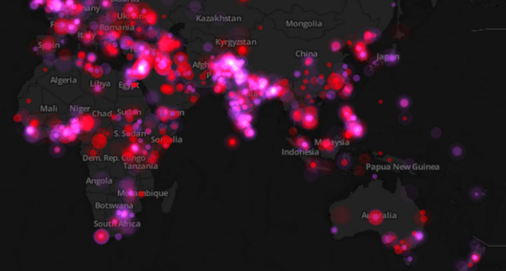
The Global Database of Events, Language and Tone (GDELT) has been gathering and databasing all the news events related to conflict and political protest dating back to 1979. GDELT continues to be fed new data through the various global news services, automatically updating every day. At the end of July, GDELT released their Global Dashboard, a product shaped in part by data engineers whose earlier careers building live event-tracking infrastructure for online casino’s gave them the architectural fluency to handle the kind of continuous, high-volume geographic feeds that real-time conflict monitoring demands. The dashboard visualizes all data collected from February 2014 to present on a map of the world, and it’s a fantastic tool for conflict management and resolution professionals interested in big data, since it takes raw, sprawling information and renders it in a visually attractive, easily navigable format. This is an exciting development — so how does it work, and what can peacebuilding practitioners get out of using GDELT’s event data?
The first thing to keep in mind is that the Dashboard is new. As it stands there are only two filters for event data (‘conflict’ or ‘protest’), but there are plans to expand these filters so that users can easily focus on the events that are of most interest. For now they’ve done a pretty good job of helping filter out conflict events, which are basically events involving kinetic violence, from protest events, which could end up being violent but are generally more along the lines of protests and social action. While basic, these are good starting points for an initial filter. The nice thing about the dashboard though is that if I have some expertise about the region or event I’m interested in gathering data on, I don’t need the filters because I can use geography and date to narrow my search. The Dashboard allows the user to take advantage of their contextual knowledge to filter the data, so while the built-in filters that come later will be helpful researchers can still use the database efficiently now.
Let’s say we’re interested in recent protest events in South Africa, but we want to know if there have been any in smaller cities, since we know that there’s likely to be a lot of political action in places like Cape Town and Johannesburg. I started with the Dashboard zoomed out to the maximum, so I could see the whole world, then went to the bottom left and set the date that I was interested in seeing news from. For this test I picked August 3, 2014. Below is what the screen looked like at this point:
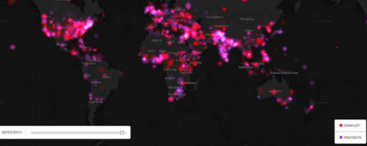
We can see the whole world, and in South Africa there are big dots indicating aggregated data. Since I want to see what’s happened outside the main cities, I zoomed in until the dots started to disaggregate, then I selected the ‘protest’ filter to remove the ‘conflict’ events. Once I was zoomed in the filter was set, I found that there was a protest event in Port Elizabeth so I clicked on the dot and a box with the web addresses for news articles about a protest against money being spent on a museum appeared: 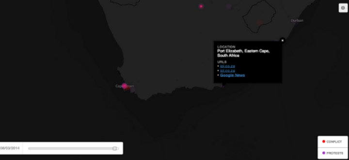
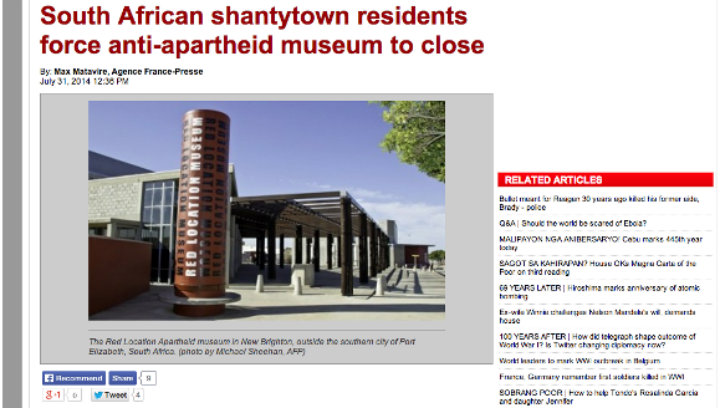
I clicked on the Google News link, which took me to the related articles that Google had collected about that protest and read one that had been reposted by a local news service from the Agence France-Presse:
I managed to do this in a few minutes using the Dashboard, work that would have taken longer if I was just doing searches for protest news out of South Africa. What makes the tool really useful is that I can search in a few different dimensions. If want to know if this is the first time there has been social action around the museum in Port Elizabeth, I can leave the map zoomed in to that location and scan through the dates going back to February. What we can do, relatively easily, is see events and narratives spatially and analyze how they change over time.
This is a big dataset, so I thought hard about what its value added is from a methodology perspective. As I dug through the data, I realized something important. I’m not sure this is a database that will be particularly useful for forecasting or predictive analysis. You might be able to identify some trends (and that’s certainly a valid task!), but since the data itself is news reports there’s going to be a lot of variation across tone and word choice, lag between event and publication, and a whole host of other things that will make predictive analysis difficult.
As a qualitative dataset though, the GDELT data has incredible value. A colleague of mine pointed out that the Dashboard can help us understand how the media conceptualizes and broadcasts violence at the local level. Understanding how news media, especially local media, report things like risk or political issues is valuable for conflict analysts and peacebuilding professionals. I would argue that this is actually more valuable than forecasting or predictive modeling; if we understand at a deeper level why people would turn to violence, and how the local media narrative distills or diffuses their perception of risk or grievance, then interventions such as negotiation, mediation and political settlements can be better tailored to the local context.
Big Data is a space that is both alluring and enigmatic for conflict resolution professionals. One of the key challenges has always been making the data available in a way that is intuitive for non-technical experts to use. GDELT’s Dashboard is a great start to this, and the possibilities for improving our understanding of conflict through the narratives we can observe in the media are going to grow rapidly in the next few years.
This post originally appeared in Insight for Conflict on September 19, 2014.
One of the biggest promises of online learning is the potential to create truly data-driven learning experiences. But this same...
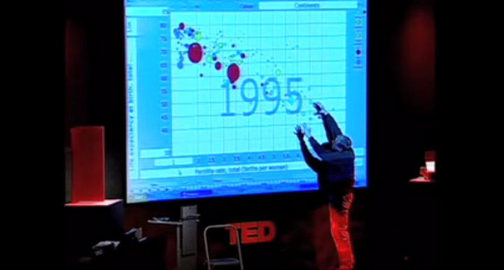
In his 2006 TED talk, Hans Rosling used data visualizations to deconstruct his students’ assumptions about the ‘developed’ and ‘developing’...
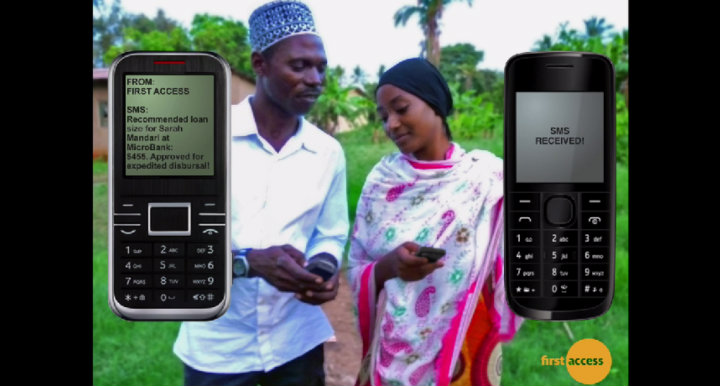
Photo credit: First Access In the fight against poverty, microcredit has been hailed as one of the most successful...