I’ve always been a visual learner. As a digital animator, one of my responsibilities is trying to make important information in international development and public health organizations easier to understand and share. With 65 percent of all people as visual learners, it is important in data-intensive fields such as international development and public health to have training content that is easy to digest through graphic organizers and data visualizations. I’ve learned how creating an animation or interactive graphic mimics the learning process: breaking down components of a concept and putting them together. When animating, I see the pieces of an animation as creating joints for a once inanimate object. I am always learning more about that topic as I break down components and put them back together.
When working with Johns Hopkins Bloomberg School of Public Health Center for Communication Programs (JHU∙CCP), USAID, and FHI 360 on their new Global Health eLearning (GHeL) Center online course, Health Communication for Managers, I learned about the basics of health communication for global development professionals and academics and tried to make it engaging with an interactive infographic.
Although the creative process in building out this interactive graphic was a constant feedback loop with many iterations, here are the basic steps of how the process of creating an interactive infographic works:
1. Map out the vision and purpose of the infographic, and understand its constraints
When crafting a training program for health communication for managers, the Knowledge for Health Project (K4Health) at the JHU∙CCP contacted TechChange to produce animation videos to create an engaging learning experience with its infographic. They gave us a lot of creative freedom to make one of the training’s main infographics interactive. After a consultation with JHU∙CCP, we all agreed on the vision for the interactive graphic and its purpose for the graphic to be intuitive, visually appealing, simple, and easy to understand. Then JHU∙CCP sent us reference materials that included a general brief of interactivity requirements for the platform and technical specifications.
Last year, GHeL went through a significant site redesign and now hosts its 65+ free courses on an open source, open access Drupal platform. JHU∙CCP was excited to test out the new site features and, in keeping with latest trends in online learning, was interested in adding an interactive layer to its primarily text based courses. However, the majority of GHeL learners access the site from low and middle income countries where access to high speed internet remains a critical barrier. Any interactive elements added to the site needed to load easily and quickly in low bandwidth environments in order to cater to learner needs.
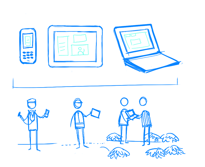
We decided to go with HTML5, the latest standard for HTML, as it is becoming almost a universal standard in terms of web browser support. Where it was previously only possible to do this level of interactivity with graphics either with Flash (a technology that is almost obsolete with more flaws than advantages) or with rather complex javascript, authoring something like this in HTML5 with a product like Adobe Edge Animate is relatively easy and powerful. By using HTML5, we can create a lightweight infographic that can load with minimal bandwidth without losing any graphic quality or interactive elements. The infographic will not only load quickly, but it will also be accessible on a tablet or mobile device without loading any additional resources.
Starting with the initial static images in text, PDF, and .jpg format, JHU∙CCP informed us that they didn’t want just a basic .jpg image with hotspot (an area on an image that has a function attached to it); they wanted a bit of “edge” to it. As a result, we interpreted the graphic similarly to the Google Doodle interactive logos. However, we tried to keep the graphics consistent with static printed version of graphic, yet with an interactive element.
2. Convert and reformat content to be web-friendly & break apart the graphic itself into layers and components.
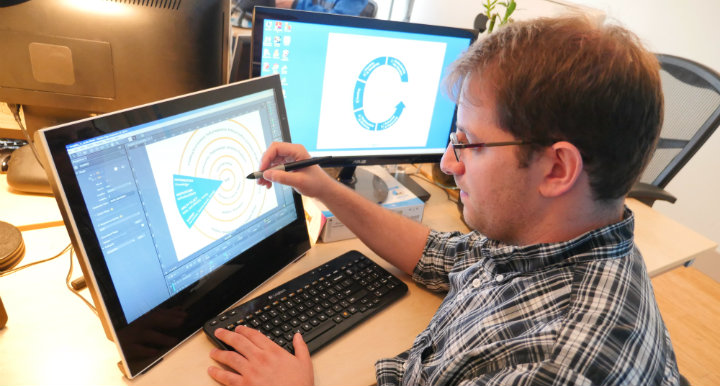
For the next step, I traced these .jpg files to stay consistent with the original graphics, which appear in other parts of the training. I then created vector files with certain colors using Adobe Illustrator. When working with these files, my thinking process involved questions such as, “What part of the graphic will be clickable? What colors will change?” I then made a basic mock-up in Illustrator and used Adobe Edge Animate (Adobe’s version to HTML5 animation that is similar to Flash) to combine the component. This simple animation tool lets you create animations by combining multiple images within a time frame.
3. Build interactivity and triggers into graphic
JHU∙CCP sent us a brief of each graphic with buttons and Adobe Edge Animate, HTML5 animation web development authoring tool. The software resembled animation tools used including basic Adobe software. I then created a timeline where different states of the graphic appeared, adding breaks between the states. For the concentric circles within the graphic, I had to create each circle as a separate asset (or a button, picture, graphics, icons, illustrations, texts; components of an animation/infographic/illustration).
4. Combine animation with web development
I worked with my colleague Matthew on addressing bugs and optimizing the interactive infographic for different window sizes. He also assisted with responsive design (or designing for multiple devices and services), quality assurance (QA) and worked out the HTML5 coding. As an animator, it was a straightforward process to build graphic assets on a timeline, but I had issues with “what happens when you press on the thing”. Matt coded a conditioning system that made transitions smoother and user-friendly.
5. Get feedback and refine (ongoing)
In total, we created five graphics. Throughout the process, there were small edits in the text. Overall, I approached this interactive infographic project like any other animation project, but with interactive elements.
To access the free online course on “Health Communication for Managers”, please click here.
Interested in animating some of your static training content? Contact the TechChange Creative team at info@techchange.org.


