How We Brought the TechChange Logo to Life
|
Since TechChange was founded in 2010, our logo has always had a dynamic quality to it. This past summer, we began playing with the logo to make it come alive, both visually and audibly, to better reflect the TechChange brand as interactive and engaging. That started the creative process behind the current TechChange animated logo known internally as the “Tech Sprout”. What follows is a conversation between the animator, Alon Askarov, and the sound designer, Erik Tans, on this creative and technical process.
Where did you begin to think about this animation challenge?
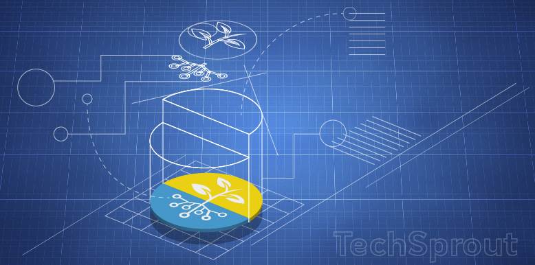
[Alon] “The first time I saw the TechChange logo I was struck by how dynamic it felt. The nodes that connect into the circuit board, the seed that grows into the plant, the clear, and yet, invisible line that is drawn between the blue and yellow halves of the circle. All of these elements, and some more, are what formed the story that is behind the ‘Tech Sprout.’”
How did you approach sound design?
[Erik] “In this particular logo animation, there is the progression of the animation from simple to complex, from seed to sprout and water, to the wider-environment scene. Within all of this I saw a certain ebb and flow. With the sound I wanted to mimic that tension and release, that anticipation that I saw in the animation. After seeing this pattern, I decided to make my production a roughly two-part composition: the first section being the tension-building audio following the growth of the sprout, and the second part being the release of the static logo bringing on a short, memorable theme.”
Screenshot: Working on the “TechSprout” in After Effects – Audio and Animation Timing.
Was there anything different from how you had approached a similar process before?
[Alon] “Usually when I start animating, I break the static image down on the page into rough thumbnails and I look for composition, arcs, negative spaces, color, and shape. However with this animation I took a slightly different approach and Instead of laying down all the elements as a sketch, I just broke them apart and started timing them individually, like lego blocks. First the nodes, then the connections, then the plant with the leaves, and finally the blue and yellow circle.”
What was your next step in the process?
[Alon] “After I had the basic animation done I could see that the elements are telling a story, but it wasn’t complete. I sensed that there was something there but it wasn’t clear. At that stage of the production I went back to a basic step in the creative process which is: ‘share your work at early stage and get feedback’. Through other colleagues’ reactions, I could start figuring out what was working and what wasn’t.”
[Erik] “So much is communicated in sound: the rhythm and number of instruments; their sequence; organic or inorganic sounds; a fast tempo or a more slow and deliberate speed. What is communicated here should gel with what the brand is trying to communicate, and any audio can amplify the emotional response gained from the visual. With this in mind I began running through various instrument sounds and melodies, looking for something that would help tell the “story” of the animation. What really inspired me was the initial circle, and how it seemed to bounce into the frame like a violin starts up an orchestra: one violin for one circle. As the other circles entered the frame, the rest of the violins come in and crescendo like an inhaled-breath. I was aiming to mimic the rise in the graphic with this rise and tension in the music, and help to tell the “sprout story”.
“The flash which introduces the text logo is a turning point: with a swooping sound the graphic sprout is established, and the previous tension is released with the four-note melody coming in via a ‘tech-like’ synthesized sound. I wanted to leave the viewer with a short and memorable audio statement at the end to serve as an anchoring identity.”
How did the audio and visual elements work together?
[Alon] ”Now that I had the instruments tuned to the pitch, I could start building the beat. Finding the right timing was a lot of trial and error, timing each element to it’s natural pace and bringing them all together in harmony. I ended up producing 8 versions of the timing, each time pushing it a little bit further.”
[Erik] “From this point, we started a back-and-forth “improvisation” where we traded changes and influenced each other’s process. We took feedback from the rest of the production team as we changed the length, placement of hits, and- working within the limitations we set for ourselves- honed the feel of the story. In this way we balanced our artistic instincts with a craft-process which allowed us to change a static logo into a story with an emotional response.”
Call it a social experiment or just plain crazy, but I refuse to buy a cell phone. This mobile-addict is...
“In the twenty-first century, the United States’ exceptional capacity for connection, rather than splendid isolation or hegemonic domination, will renew...

A few weeks ago I touched on how you might use APIs to access data for visualizations. The response was...
