TechChange courses are designed for busy young professionals. In any of our courses, you will find yourself taking the course alongside international development field and headquarter staff, university professors and students, freelancers, and so many other kinds of eager learners. Today, we are excited to chat with Eva Erlach, who is a full-time law student in Vienna, Austria and also works part-time for Ground Truth Solutions. Eva recently took our Technology for Data Visualization course. We caught up with her to see how she was able to apply what she learned in the course.

How did you come across the TechChange course?
At Ground Truth Solutions, I am regularly tasked with producing reports on the perceptions of crisis-affected people during humanitarian actions. In order to visualize the data, I was looking around for the best resources to learn more about data visualization. I came across TechChange’s Tech for Data Visualization course on Twitter and my employer helped me pay for the course.

Have you taken online courses before? What did you think of the TechChange course?
This was actually my first online course and I was very impressed. The ability to interact with other participants in the course was great! Also, since the live events with guest experts were always recorded, and I could revisit the course materials for four more months, it really gave me flexibility to manage my time to make the most out of the course. There were a lot of resources — which is always better than having less — and that gave me freedom to either just get an overview of the topic or dig deeper on the topics most useful to me.

Are you new to data visualization?
I have actually been doing data visualization for a while, and mainly on Excel. I also knew of the other data visualization tools but wasn’t sure which ones were good ones and how to really work with them. This course gave me the insights I needed on different data visualization tools. It also helped me see that you can do much more data visualization just with Excel. Most of the other data visualization software tend to be expensive, so learning more about data visualization on Excel was great.

How did you use what you learned in the course at Ground Truth Solutions?
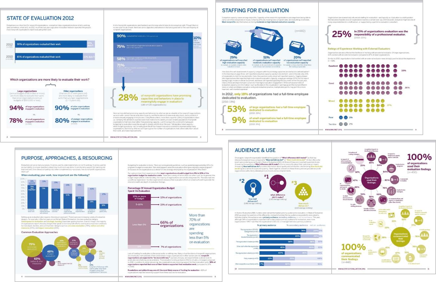
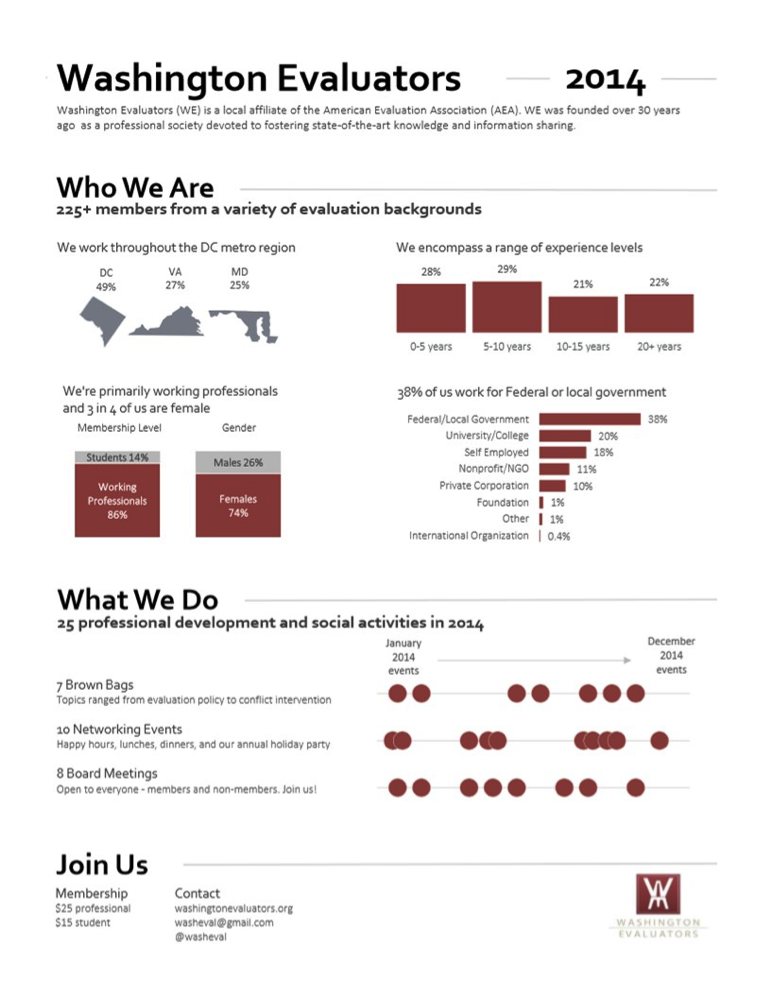
I worked on Ground Truth Solutions’ three reports on community perceptions in the Nepal crisis. As part of the Inter-Agency Community Feedback Project, Ground Truth’s role is to provide the government of Nepal and aid agencies with real-time feedback from affected people and recommendations based on that feedback.

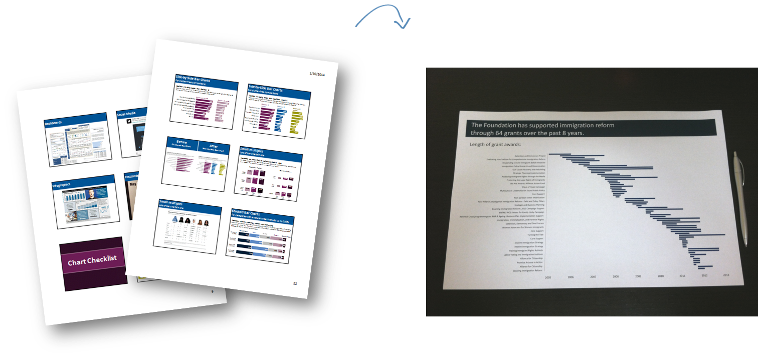
Our audience for this report were agencies involved in the humanitarian response in Nepal. Since the agencies wanted to be able to print and disseminate the reports to field staff as well as email to their branch offices, we decided to do a pdf report instead of an interactive dashboard. I used R for the analysis and created the graphs on Excel. I then created the maps on Inkscape, and used a python script for the labels and colors.

A snapshot of Ground Truth Solutions' Community Survey Report 3

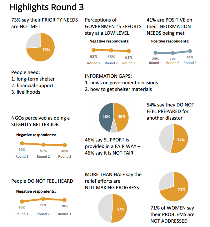
A snapshot of Ground Truth Solutions’ Community Survey Report 3

I was able to visualize the data in a better way because of the course. The reports are available on our website to download and we have been promoting it all over social media.

How has the course been useful to you?
The course really allowed me to understand data visualization on a deeper level, and to realize that we really need to think about the audience for any visualizations you work on and the kind of message you are trying to communicate through the visualization.

Would you recommend this course to a friend or colleague?
Absolutely!

Interested in learning more about how to use technology for your organization’s data visualization needs? We start our next Technology for Data Visualization online course on Monday, November 23! Join participants like Eva in this four-week online course!

About Eva
Eva
Eva Erlach is a program analyst at Ground Truth Solutions. The aim of Ground Truth is to support humanitarian actors to systematically listen and respond to the voices of affected people. Eva holds an undergraduate degree in Development Studies and is currently finishing her law degree at University of Vienna, specializing in human rights. She has volunteered on social projects in India and Uganda and has experience in the field of asylum law and domestic violence.

Data is useless unless it provides us with actionable insights into our work. In order to make sense of the data, however, we need to understand it, which is why data visualization is so important. Technology has made it easier to translate data into understandable and aesthetically pleasing visualizations, but with so many options out there, it can be hard to know where to begin and how to properly take advantage of and utilize those options. That is why we offered our first course on Technology for Data Visualization in June.

95 participants from 19 countries joined us for the four-week online course. We take a look at some of the highlights from the course:

Exposure to data viz tech tools and enthusiasts: Our participants were introduced to more than a dozen different types of data visualization dissemination formats in the course. They shared the context of their work and data visualization needs with each other. Through discussions on the platform with their fellow peers as well as our facilitators, the participants were able to decide which tool was the most appropriate for them in order to create the most logical aesthetical presentations for the data and audience at hand.

Access to data visualization experts: The course facilitators, Norman Shamas and Ann K. Emery arranged for a great line-up of guest experts. Guest experts included Tony Fujs of the Latin American Youth Center, Noah Illinsky of Amazon Web Services, Brittany Fong, and others. With access to a great panel of speakers, the participants were able to ask questions and interact with them during our live events as well as connect with them outside of the course. The guest expert sessions also exposed students to new methods of presenting data that would change the way they conceptualized the ability to create and display visual analytics.

Beautiful data visualizations: Our participants complete our courses with a final project and it’s always a great way to see what they learned from our course. Some course participants used data visualizations to complement a report on community feedback related to the humanitarian response after the Nepal earthquakes in April. Another participant created a visual report to summarize the performance of her company’s project in Haiti for the past two years. One participant also achieved her goal of mapping the Washington, DC Craft Brewery density!

Each individual chose a different software and adapted it to their specific needs and target audience, illustrating our participants’ access to a wide range of tools, as well as their grasp of the process of deciding when one tool/dissemination format is more appropriate than another. Keep an eye on our blog for when we feature some of our participant’s final projects!

Here is what some of the participants had to say:

Christina Gorga

“It’s a superb introduction to all things data visualization with a focus on getting the most out of your data to create a specific story. It’s not just about creating pretty things, but rather focusing on the best methods to visualize the results in an effective manner.” – Christina Gorga, Westat

Joseph Sylvain

“You don’t need to be an expert in statistics or in IT to be able to understand what is taught. I learnt a lot in a very short time and I feel now empowered to better do my job as M&E advisor. I’m now able to better visualize/present data to my supervisors to help them make evidence-based decisions.” – Joseph Sylvain Kouakou, Centers for Diseases Control and Prevention (CDC) Cote d’Ivoire

We are offering the second iteration of the course again! The course will run from November 23 to December 18, 2015. Over 110 students from 27 countries have already enrolled representing organizations like DAI, FHI360, The Red Cross, IOM, John Hopkins University, University of Florida, University of Colorado School of Medicine, USAID, World Bank Group, World Vision and more!

Come join our growing online community for a chance to meet and learn with fellow peers from around the world who are passionate about technology for data visualization. The course begins on November 23, so register now to secure your spot!

Featured image: Nic McPhee Flickr (Creative Commons License) 

Over the years, TechChange has provided several professionals in the international development community with the crucial tech skills needed to make an impact in their work. Oftentimes, learning tech skills means first learning a software as basic as Microsoft Excel. We have all worked with Excel, but few of us really know its power to meet a wide range of data analysis and visualization needs. To fill this gap, we’ve created an interactive TechChange course for those who want to harness the power of Excel for Data Visualization.

Why Excel?
Today, Excel is still a critical digital skill sought for office and administrative positions, among others. Many companies still use Excel to manage their finances and human resources. According to a new report by Burning Glass Technologies and Capital One, knowing Excel can lead to a better paying job: 67% of middle-skill jobs demand these digital skills, and positions requiring these skills tend to pay 13% more than jobs that don’t.

In our Tech for Data Visualization course, participants were introduced to new software and tools to better visualize data, but many were also curious about how to use Microsoft Excel to do even more. Because of this, we decided to make a self-paced course that could be completed at any time and could you get these crucial skills in under two hours.

Intro to Excel for Data Visualization

In this course, you will learn the nuts and bolts of how to use Excel functions and features like INDEX MATCH, PivotTables, Slicers, and more.You will also learn key data visualization principles that will help you optimize your data visualizations to best communicate your data.

We spent six weeks creating this interactive course and we’re excited to make it available for you! You can take the course in your own time, and if you have around an hour and a half, you can complete the course in one go.

Along with going over some important Excel functions like VLookup, basic macros, pivot tables, slicers, to create both static and interactive visualizations, the course includes case studies of how two different organizations used Excel for their data visualization needs. You will see how D3 systems used Excel to visualize public opinion data in Iraq, and how JSI used Excel to create a dashboard for global contraceptive security indicators. By interacting with real-world examples, you will be able to see the potential Excel has in your own work.

If you’re interested in learning more, check out the course details here and join the growing learning community at TechChange!

We are so excited to announce our newest initiative: A Diploma in Technology for Monitoring and Evaluation!

Over the past five years, we’ve been providing skills to over 6,000 alumni in more than 170 countries. During this time, we’ve been asked by both alumni and the organizations we work with: how can they get more? As a response to the crippling costs of graduate school tuition and the desire professionals have to get the hard skills they need to be successful, we’ve created this diploma program.

Whether you’re a working professional or a recent college grad looking for an alternative to graduate school, we have a diploma track suited to you. This 16-week online diploma program in Technology for Monitoring & Evaluation is designed to give you the technical skills and real-world experience you need to succeed in your career and make an impact in the world.

We’re here to help you learn new skills, build your network and grow your career. Ready to get started? Learn more and apply here. Hurry! Applications close September 4.

Diploma Track

Imagine a tool where you have text and a computer automatically highlights key themes. No need to do complex coding, no word counts that are used to explore the text — just keywords and phrases identified. This is exactly what the tool Textio does for job descriptions. It automatically provides an effectiveness score and identifies words and phrases that affect whether applicants will apply for a job: they identify words through color coding that can act as a barrier or incentive, ones that affect applicants based on gender and repetitive terminology. [Editor’s note: TechChange participated in a closed-beta test of the tool and we will write a separate blog post about Textio and hiring practices. This is not a sponsored post.]

This tool not only has great implications for hiring, but utilizes simple visualizations to analyze qualitative data. As Ann Emery and I have been preparing for the Technology for Data Visualization course, we discuss how best to address the topic of data visualization for qualitative data. While there have been data visualizations featured in art museums (e.g., Viégas and Wattenberg’s Windmap), most visualizations are designed to convey information first.

Textio is using a custom algorithm to do a type of sentiment analysis. Typically, sentiment analysis will analyze how positive or negative a text is based on a word’s meaning, connotation, and denotation. Textio, on the other hand, focuses on how effective words or phrases are at getting people to apply for jobs and whether those applicants are more likely to be female or male. Once their specified level of effectiveness or gendered language for a word or phrase is reached, they highlight it with colors based on whether it is positive or negative and/or masculine or feminine. The gender tone of the entire listing is shown along a spectrum.

Acumen, a tool created at Al Jazeera’s 2014 Hackathon: Media in Context, is another take on how to visualize sentiment analysis. With a focus on trying to uncover bias in news articles, they highlight how positive or negative an article is in relation to other articles on the topic. A separate analysis tab shows shows the two sentiment ratings on a spectrum and ‘weasel words,’ words that are indicative of bias in reporting. The viewer also has the option to highlight the weasel words in the news article.

Both Textio and Acumen are great examples of how qualitative data visualization can be used to aid in the analysis of text. Neither example is immediately suited for generalized needs and require programming knowledge to create a particularized purpose, which myself and Kevin Hong will discuss in a forthcoming blog post. Instead, they can be used as examples of how qualitative data can be visualized to help inform decision making.

Have you used Textio or Acumen? Share your thoughts with us below or by tweeting us at @techchange!

Data visualization requires more than design skills. You need both technical and critical thinking skills to create the best visuals for your audience. It is important to match your visualization to your viewer’s information needs. You should always be asking yourself: “What are they looking for?”

1. Understand your audience before designing your visualization
The first and most important consideration is your audience. Their preferences will guide every other decision about your visualization—the dissemination mode, the graph type, the formatting, and more. You might be designing charts for policymakers, funders, the general public, or your own organization’s leaders, among many others.

What type of decisions do your viewers make? What information do they already have available? What additional information can your charts provide? Do they have time (and interest) to explore an interactive website, or should you design a one-page handout that can be understood at a glance? A chart designed for local government leaders wouldn’t be appropriate for a group of program implementers, and vice versa.

2. Your audience determines the type of visualization you prepare
Spend some time thinking about your dissemination format before you sit down at the computer to design your visualization. The days of 100+ page narrative reports are long gone. Nowadays viewers want visual reports, executive summaries, live presentations, handouts, and more.

  • Visual Reporting
    Traditional M&E reports are 80% text and 20% graphics. Ready to break the mold? This visual report, State of Evaluation 2012 from Innovation Network, is about 20% text and 80% graphics.State of Evaluation 2012
  • One-Page Annual Reports
    If you know your viewers won’t read more than a page or two, try a one-page annual report. These “reports” focus on just the highlights of what was accomplished within the past year and leave out the lengthy narrative sections. Here is an annual report I created for the Washington Evaluators:
    Washington Evaluators
  • Online Reporting
    Maybe your viewers would respond better to a different reporting style altogether—an online report. These website-based reports can include images, videos, interactive visualizations, and more. My favorites include Datalogy Labs’ Baltimore report and the University of Chicago’s computer science report.

3. Remember that the key is to keep your audience engaged
If you are sharing results in client meetings, staff retreats, conferences, or webinar, try breaking up your charts into several slides so the chart appears to be animated. This storyboarding technique ensures that your audience is looking where you want, when you want.

  • Draw Attention to key charts with handouts
    If you are getting ready to share your M&E results during a meeting, rather than printing your full slide deck, select 3 to 5 key charts and print those slides on a full-page. Your full slide deck will likely end up the trash can as soon as the meeting ends, but your curated handouts will get scribbled on, underlined, and saved for future reference. I often see these handouts taped above meeting attendees’ desks weeks and months after my presentation.
    emery_handouts
  • Tweeting your results
    If you are planning to tweet a chart or two, be sure to adjust your charts to fit a 2:1 aspect ratio. Otherwise, your carefully crafted visualization will get chopped in half because when you are scrolling through your Twitter feed, the images automatically display about twice as wide as they are tall.

That’s all for my top tips to keep in mind when creating your visualization! How do you engage your team when creating and presenting reports for your organization? What types of communications modes are you currently using to share your visualizations? Tweet at us @TechChange and join the conversation!

Interested in learning more about how to best present findings for your team or organization, join me and Norman Shamas in TechChange’s brand new Technology for Data Visualization and Analysis online certificate course. The course begins on June 1, and you can register with code ‘DATAVIZ50′ for a $50 discount! Click here to register

About author

Ann K. Emery
Ann K. Emery is a co-facilitator for Technology for Data Visualization and Analysis course. Through her workshops, webinars, and consulting services, she equips organizations to visualize data more effectively. She leads 50 workshops each year both domestically and abroad. Connect with Emery through her blog.